Expensive-looking wall art doesn’t require an expensive budget—it requires smart shopping strategies and insider knowledge that most homeowners never discover. While the average homeowner spends $800-1200 on wall decor annually, savvy decorators achieve the same sophisticated look for under $200 using proven techniques that interior designers guard jealously.
The decorations market worldwide is set to bring in $31.3B in 2025 and is projected to grow at an annual rate of 3.7%, yet most people overpay dramatically for gallery-worthy aesthetics. The global wall art market size was valued at $63.61 billion in 2024 and is anticipated to grow from $66.89 billion in 2025 to $118.79 billion by 2032, proving that stunning wall art remains a top priority for homeowners seeking sophisticated interiors.
This exclusive guide reveals the exact strategies professional decorators use to source, frame, and display affordable art prints that fool even the most discerning eyes. Whether you’re furnishing your first apartment or refreshing an established home, these insider secrets will help you create million-dollar aesthetics without breaking your budget.
The Psychology Behind “Expensive-Looking” Art
What Makes Art Look Expensive? Professional presentation trumps actual cost every time. Expensive-looking art combines high-quality printing, sophisticated framing, strategic placement, and confident styling that suggests substantial investment regardless of actual price points.
The Premium Perception Formula:
- Sharp image resolution: Crisp details that maintain clarity even under close inspection
- Professional framing: Quality materials and expert installation techniques
- Strategic sizing: Appropriately scaled pieces that command attention without overwhelming spaces
- Confident placement: Gallery-worthy positioning and lighting that suggests museum-quality curation
- Cohesive styling: Thoughtful arrangements that demonstrate sophisticated taste and intentional design
Trick #1: Master the Art of High-Quality Reproduction Hunting
Source Identification Strategies: The difference between cheap-looking and expensive-appearing prints often comes down to source selection and image quality rather than original artwork value.
Premium Source Categories:
- Museum reproduction collections: Major museums offer high-resolution downloads of public domain masterpieces
- Artist licensing platforms: Sites like Society6, Saatchi Art, and Etsy featuring original designs at affordable prices
- Photography stock sites: Professional images available for print licensing at fraction of gallery costs
- Vintage poster archives: Classic travel, advertising, and cultural posters in high-resolution formats
- Digital art marketplaces: Contemporary artists selling direct-download prints for under $25
Quality Assessment Checklist:
- Minimum 300 DPI resolution for crisp printing at desired sizes
- RGB color profiles optimized for home printing rather than CMYK commercial formats
- Scalable vector formats when possible for ultimate flexibility in sizing
- Artist authenticity verification ensuring proper licensing and original creation
Budget Breakdown Strategy: Allocate 30% of your budget to sourcing quality digital files, 50% to professional printing, and 20% to framing materials for optimal results.
Trick #2: Transform Budget Printing Into Gallery Quality
Professional Printing Without Professional Prices:
Online Service Advantages:
- Costco Photo Centers: Surprising high-quality printing at fraction of specialty shop prices
- FedEx Office locations: Professional paper options and large format capabilities
- Local print shops: Often match online prices while providing personal service and quality control
Paper Selection Secrets:
- Matte finish papers: Hide imperfections while creating sophisticated, gallery-like appearances
- Heavyweight stocks (200gsm+): Feel substantial and professional when handled
- Archival quality papers: Ensure longevity and color stability over time
- Textured surfaces: Add visual interest and expensive tactile experiences
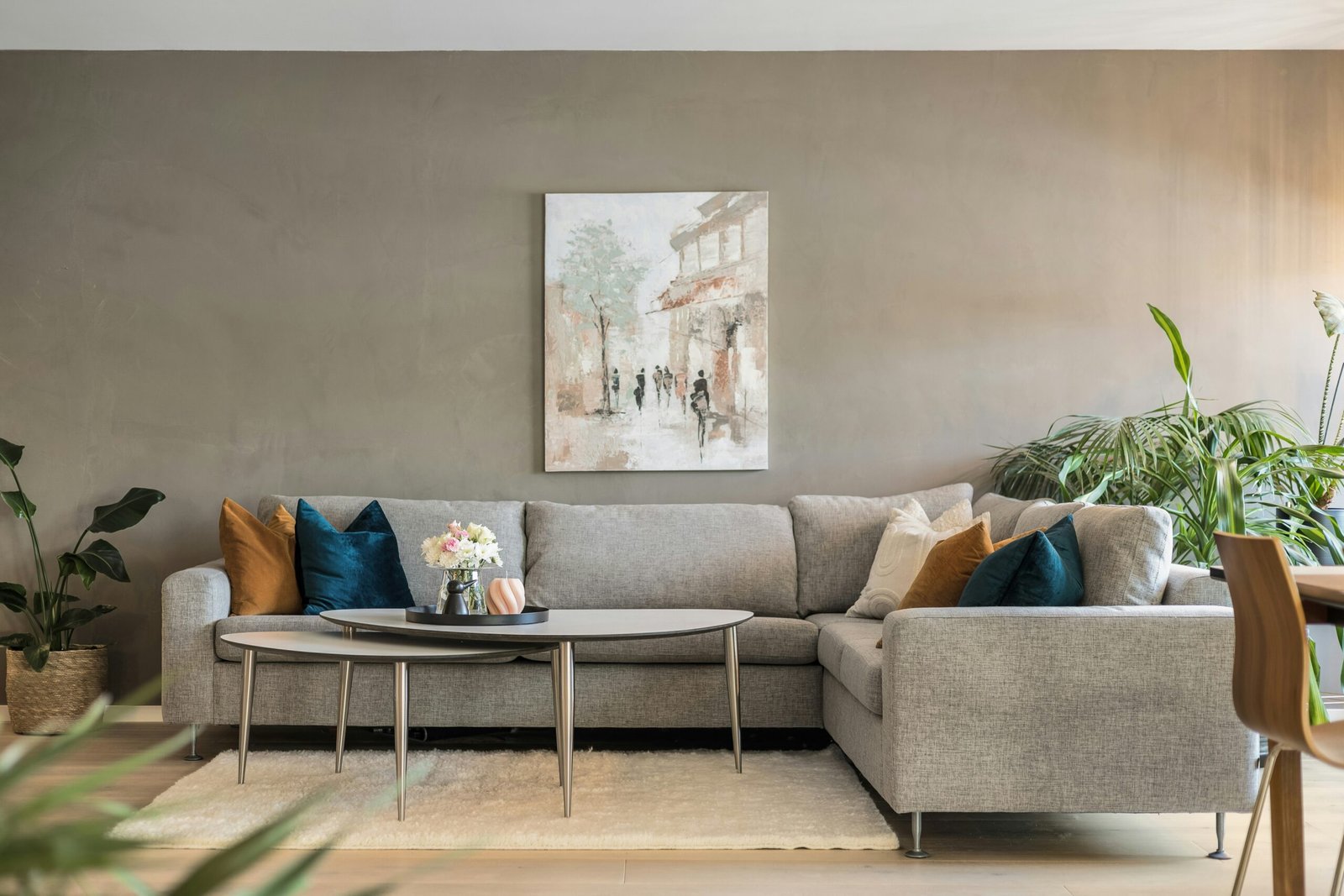
Size Strategy Intelligence: Large prints often cost proportionally less per square inch while creating dramatically more expensive appearances. A single 24″x36″ print typically looks more valuable than multiple smaller pieces of equivalent total cost.
Trick #3: Master the Expensive-Looking Frame Game
Frame Selection Psychology: The frame makes or breaks the expensive illusion. Professional-looking frames can transform $5 prints into $500-looking artwork instantly.
High-Impact, Low-Cost Frame Options:
- IKEA Ribba and Hovsta series: Clean, modern designs that mimic expensive gallery frames
- Target’s Gallery frame collection: Sophisticated profiles at department store prices
- Amazon Basic frames in bulk: Consistent styling across multiple prints for cohesive gallery walls
- Thrift store frame makeovers: Vintage frames updated with spray paint for custom looks
Professional Framing Hacks:
- Mat board inclusion: White or cream mats instantly elevate perceived value and create breathing room
- Consistent frame widths: Using identical frame profiles across different sizes creates expensive, curated appearances
- Strategic color coordination: Black frames for contemporary sophistication, white for Scandinavian elegance, wood tones for organic warmth
DIY Matting Secrets: Purchase pre-cut mats online for fraction of custom framing costs, or cut your own using metal rulers and sharp craft knives for perfectly crisp edges.
Trick #4: Strategic Sizing That Screams High-End
The Scale Confidence Formula: Expensive-looking art fills appropriate space confidently rather than timidly hugging furniture or floating lost on expansive walls.
Professional Sizing Guidelines:
- Above sofas: Aim for 66-75% of furniture width for substantial, intentional appearance
- Statement walls: Single large pieces (30″x40″ or bigger) command more attention than multiple small prints
- Hallway galleries: Vertical orientations enhance architectural proportions while feeling purposeful
- Bedroom displays: Horizontal arrangements above headboards create hotel-suite sophistication
Budget-Friendly Large Format Solutions:
- Engineer prints: Black and white large-scale prints from office supply stores cost under $10
- Poster printing services: Full-color large formats available for $15-25 at most print shops
- DIY mounting systems: Foam core backing and corner mounting create frameless, contemporary presentations
Trick #5: Color Coordination That Suggests Professional Curation
Sophisticated Color Strategy: Expensive-looking art collections demonstrate intentional color relationships rather than random aesthetic choices.
Professional Color Approaches:
- Monochromatic sophistication: Various shades of single colors create refined, expensive appearances
- Limited palette coordination: Restricting colors to 2-3 hues suggests curatorial expertise
- Neutral foundation emphasis: Building collections around grays, blacks, whites, and natural tones
- Strategic accent integration: Using artwork to introduce consistent accent colors throughout spaces
Color Psychology Applications:
- Cool tones (blues, grays): Suggest contemporary sophistication and professional taste
- Warm neutrals (creams, taupes): Create expensive, timeless elegance without trendiness
- High contrast combinations: Black and white or dramatic color oppositions command attention and suggest confidence
Trick #6: Lighting That Creates Gallery Ambiance
Professional Lighting Without Professional Installation:
Affordable Lighting Solutions:
- Picture ledge lighting: Battery-operated LED strips hidden behind frames create dramatic uplighting
- Track lighting systems: IKEA’s affordable track lights provide adjustable gallery-style illumination
- Table lamp positioning: Strategic placement creates accent lighting that enhances artwork visibility
- Natural light optimization: Positioning prints to benefit from existing window light during peak viewing hours
Lighting Quality Indicators:
- Color temperature consistency: 3000K-4000K lights accurately display print colors without yellow casts
- Even distribution: Avoiding harsh shadows or bright spots that reveal amateur installation
- Dimming capabilities: Variable lighting intensity creates expensive ambiance and mood flexibility
Trick #7: Strategic Placement That Suggests Museum-Quality Curation
Gallery-Worthy Hanging Techniques:
Professional Height Standards:
- 57-60 inch center height: Standard museum hanging height works for most ceiling heights and viewers
- Consistent baseline alignment: Aligning bottom edges creates organized, intentional appearances
- Architectural relationship awareness: Positioning prints to enhance rather than compete with room features
Spacing and Arrangement Secrets:
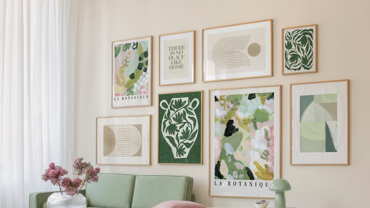
- 2-3 inch spacing: Consistent gaps between multiple prints suggest professional installation
- Visual weight distribution: Balancing dark/light and large/small elements across arrangements
- Sight line considerations: Ensuring artwork visibility from multiple room entry points and seating areas
Tricks #8-12: Advanced Expensive-Looking Strategies
Trick #8: Subject Matter Selection That Suggests Sophistication
Choose abstract compositions, architectural photography, botanical studies, or cultural themes that suggest worldly sophistication and refined taste rather than obvious decorative prints.
Trick #9: Series and Collection Development
Create cohesive collections of 3-5 related prints rather than random individual pieces. Series suggest intentional curation and substantial investment in artistic themes.
Trick #10: Texture and Dimension Integration
Mix flat prints with canvas textures, or add subtle dimensional elements through mounting techniques that create expensive tactile experiences.
Trick #11: Seasonal Rotation Systems
Develop multiple collections for rotation, suggesting extensive art investment and sophisticated curatorial practices that wealthy collectors employ.
Trick #12: Documentation and Presentation
Create simple artist information cards or maintain digital catalogs of your collection, mimicking serious art collecting practices that suggest substantial investment.
Frequently Asked Questions
Skipping quality framing and professional presentation. A $5 print in a $30 quality frame looks exponentially more expensive than a $50 print in a $5 frame. Invest proportionally more in presentation than in the actual artwork.
Look for sharp resolution, sophisticated color palettes, and subjects that suggest cultural awareness or artistic knowledge. Avoid obviously commercial or amateur-looking imagery, overly bright colors, or low-resolution files that will appear pixelated when printed large.
Consistent framing creates more sophisticated, gallery-like appearances than mixed frame styles. However, you can mix frame colors (all black, all white, all wood) while maintaining consistent profiles for cohesive yet varied displays.
Focus on total presentation cost rather than individual print prices. A $10 digital print + $25 quality printing + $35 professional frame can easily look like a $200 gallery piece when properly executed.
Use quality paper, proper framing with mats, appropriate sizing for the space, professional hanging height, and adequate lighting. These presentation elements matter more than the original artwork’s cost.
Budget Planning for Maximum Impact
Investment Priority Formula:
- 40% framing and presentation materials: Quality frames, mats, and mounting supplies
- 30% professional printing services: High-quality papers and accurate color reproduction
- 20% artwork selection and licensing: Digital files, artist fees, or print purchases
- 10% lighting and installation accessories: Hanging hardware, picture lights, or enhancement tools
Room-by-Room Budget Allocation:
- Living room focus: Invest 50% of total budget in main social spaces for maximum impact
- Bedroom sophistication: 25% budget allocation for personal sanctuary enhancement
- Supporting spaces: 25% distributed across hallways, bathrooms, and secondary rooms
Long-Term Collection Building Strategy
Patience-Based Approach: Build expensive-looking collections gradually rather than rushing to fill all wall space immediately. Quality presentations of fewer pieces create more sophisticated impressions than numerous lower-quality displays.
Seasonal Shopping Strategies:
- End-of-summer sales: Major retailers discount framing supplies and printing services
- Post-holiday clearances: Frame manufacturers offer substantial discounts on overstock
- Back-to-school periods: Office supply stores reduce printing costs to attract student customers
Investment Mindset Benefits: Canvas prints generally offer a more affordable option for acquiring large-scale artwork, providing an economical way to display high-quality art reproductions without the substantial investment of original pieces. This approach allows you to achieve gallery-worthy aesthetics while maintaining budget consciousness.
The Transformation Impact
Creating expensive-looking art displays from affordable sources provides psychological benefits beyond mere aesthetic improvement. Professional-appearing art collections boost confidence, impress guests, and create daily inspiration that enhances quality of life significantly.
Confidence Building Effects: Sophisticated wall art suggests taste, cultural awareness, and personal refinement that positively influences both self-perception and others’ impressions. This psychological boost often motivates continued home improvement and personal development.
Social Connection Enhancement: Expensive-looking art creates natural conversation starters that help guests feel comfortable discussing culture, travel, and personal interests, fostering deeper social connections through shared aesthetic appreciation.
Your Affordable Art Transformation Starts Now
The gap between budget-friendly and expensive-looking art lies entirely in execution, not in actual artwork cost. Every element of this guide—from source selection through professional presentation—can be implemented immediately using readily available materials and services.
Start with one room, one wall, or even one carefully chosen and beautifully presented print. Focus on quality presentation over quantity, and watch as your space transforms from obviously budget-conscious to surprisingly sophisticated.
The techniques revealed in this guide have helped thousands of homeowners create stunning, impressive interiors without designer budgets. Your home deserves the same level of sophistication, and now you have the insider knowledge to achieve it affordably and authentically.
Don’t let budget constraints limit your aesthetic aspirations. With these proven strategies, you’re equipped to create art displays that rival expensive galleries while spending less than most people invest in a single restaurant meal.
Your walls are waiting for their expensive-looking transformation. The only question is: which room will you elevate first?