Have you ever walked into a beautifully designed room and wondered why everything looks so perfectly coordinated? The secret often lies in the seamless harmony between wall art and flooring choices. Creating this visual symphony isn’t magic—it’s about understanding the fundamental principles of color, texture, and style coordination.
Choosing the right wall art to complement your flooring and carpets can dramatically transform your living space from ordinary to extraordinary. However, many homeowners struggle with this design challenge, often ending up with rooms that feel disjointed or visually chaotic. The good news? You’re about to discover proven strategies that interior designers use to create stunning, cohesive spaces.
Why Coordinating Wall Art with Flooring Matters More Than You Think
The relationship between your floors and walls creates the foundation of your room’s aesthetic. When these elements work together harmoniously, they establish a visual flow that makes spaces feel larger, more sophisticated, and incredibly inviting. Studies show that well-coordinated interior spaces can increase property values by up to 10% and significantly improve occupants’ mood and productivity.
Your flooring covers approximately 20-25% of your room’s visible surface area, while walls account for roughly 40-50%. This means these two elements dominate your space’s visual impact. When they clash, the entire room suffers. When they complement each other, magic happens.
Understanding Your Foundation: Analyzing Your Current Flooring
Before selecting wall art, you need to thoroughly understand your existing flooring characteristics. Different flooring types create distinct moods and require different artistic approaches.
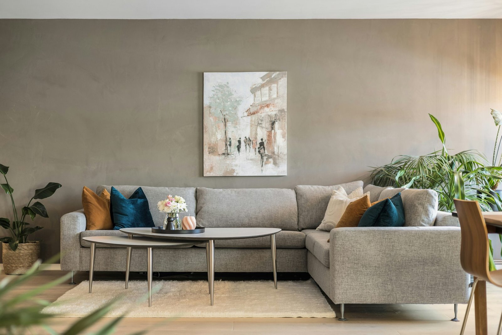
Hardwood Floors: The Versatile Canvas
Hardwood floors offer incredible versatility for wall art selection. Light oak and maple floors provide neutral backgrounds that accommodate virtually any art style. These warm, light tones pair beautifully with colorful abstract pieces, nature photography, or bold contemporary prints.
Dark hardwood floors, such as walnut or mahogany, create dramatic foundations that demand careful consideration. They work exceptionally well with lighter-colored artwork, metallics, and pieces with substantial white or cream matting. The contrast creates striking visual interest while preventing the space from feeling too dark.
Carpet Considerations: Texture and Pattern Dynamics
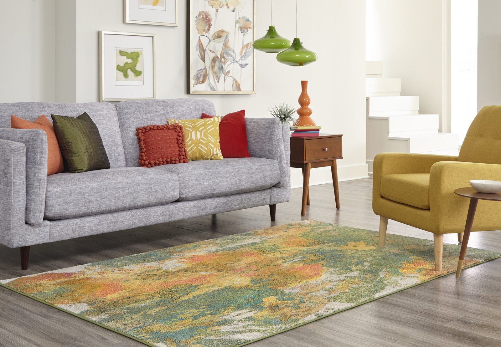
Carpeted rooms present unique opportunities and challenges. Solid-colored carpets act as neutral canvases, similar to hardwood floors. However, patterned carpets require more thoughtful art selection to avoid visual competition.
When working with patterned carpets, choose wall art that echoes one or two colors from the carpet pattern while maintaining simpler compositions. This creates cohesion without overwhelming the space. Textured carpets, such as berber or shag, pair beautifully with artwork that has similar textural elements or complementary smoothness for contrast.
Tile and Stone: Modern Sophistication
Ceramic, porcelain, and natural stone floors bring contemporary elegance to spaces. These materials typically feature cooler tones that work well with modern art pieces, photography, and minimalist designs. The clean lines of tile floors complement geometric artwork and abstract pieces with sharp edges.
Color Theory: Your Secret Weapon for Perfect Coordination
Understanding basic color theory transforms your art selection process from guesswork to science. The color wheel becomes your best friend when creating harmonious spaces.
Complementary Colors: Creating Dynamic Energy
Complementary colors sit opposite each other on the color wheel and create vibrant, energetic spaces. If your flooring features warm brown tones, consider artwork with blue accents. Cool gray floors pair beautifully with warm orange or yellow art pieces.
Analogous Colors: Achieving Serene Harmony
Analogous colors sit next to each other on the color wheel and create peaceful, harmonious environments. If you have honey-colored hardwood floors, artwork featuring yellows, oranges, and reds will create a warm, cohesive feeling throughout the space.
Monochromatic Schemes: Sophisticated Elegance
Monochromatic color schemes use various shades and tints of the same color family. This approach works particularly well in modern spaces and creates sophisticated, calming environments. Dark floors paired with artwork in various shades of the same color family create depth without visual chaos.
Frequently Asked Questions
Open-concept spaces often feature multiple flooring materials. Focus on identifying the dominant flooring type and select artwork that complements it while remaining neutral enough to work with secondary flooring.
Large-scale flooring patterns, such as wide-plank hardwood or oversized tiles, pair well with substantial artwork pieces. Smaller flooring elements, like narrow hardwood strips or small tiles, work better with medium to large-scale art to avoid creating visual competition.
Exact color matching often creates flat, monotonous spaces. Instead, aim for colors that complement or harmoniously contrast with your flooring. Use the 60-30-10 rule: 60% dominant color (often flooring), 30% secondary color (walls), and 10% accent color (artwork and accessories).
Start with pieces you love, then use matting, framing, and grouping strategies to integrate them with your flooring. Custom matting in colors that bridge your artwork and flooring can create cohesion even when the original piece doesn’t perfectly match.
Highly patterned or colorful flooring requires calmer artwork to maintain visual balance. Choose pieces with solid backgrounds or simple compositions. Black and white photography works exceptionally well in these situations, as do pieces that pull just one color from the flooring pattern.
Practical Strategies: Implementing Your Vision
Strategy 1: The Echo Technique
Select artwork that echoes colors, shapes, or textures found in your flooring. This doesn’t mean exact matching—subtle references create sophisticated connections. For example, if your hardwood has prominent grain patterns, consider artwork with linear elements or organic flowing lines.
Strategy 2: The Bridge Method
Use transitional elements like rugs, furniture, or decorative objects to bridge potential gaps between your artwork and flooring. A strategically placed area rug can tie together seemingly incompatible elements while adding texture and warmth.
Strategy 3: The Contrast Approach
Sometimes the most striking rooms feature intentional contrasts between flooring and artwork. This advanced technique requires confidence and careful execution but can create genuinely stunning results. The key is ensuring other room elements support the contrast rather than fighting it.
Seasonal Considerations and Flexibility
Consider how natural lighting changes throughout the year affect the relationship between your flooring and wall art. Rooms with significant natural light may need artwork that works well in both bright summer conditions and darker winter months.
Investing in interchangeable art systems, such as picture ledges or gallery walls, allows you to adapt your display seasonally while maintaining coordination with your permanent flooring.
Material Harmony: Beyond Color Coordination
Successful room design extends beyond color to include material relationships. Rustic hardwood floors pair beautifully with artwork featuring natural materials or organic subjects. Sleek contemporary tiles complement modern art with clean lines and geometric shapes.
Consider the era and style of your flooring when selecting artwork. Traditional parquet floors work well with classical or vintage-inspired pieces, while modern luxury vinyl pairs beautifully with contemporary photography or abstract art.
Lighting: The Often-Forgotten Factor
Lighting dramatically affects how colors appear and how artwork relates to flooring. Natural light reveals true colors, while artificial lighting can shift color perception significantly. Test your artwork and flooring combinations under various lighting conditions before making final decisions.
Consider installing adjustable lighting systems that allow you to highlight artwork while maintaining proper illumination of your beautiful flooring choices.
Creating Your Action Plan
Start by photographing your current flooring in different lighting conditions. Use these photos when shopping for artwork, either in person or online. Many art retailers now offer virtual room visualization tools that help you see how pieces will look in your specific space.
Create a color palette based on your flooring, then expand it with two to three complementary or harmonious colors for artwork selection. This focused approach prevents overwhelming choices and ensures cohesive results.
Conclusion: Your Journey to Perfectly Coordinated Spaces
Matching wall art with flooring and carpets isn’t about following rigid rules—it’s about understanding principles that help you make confident, beautiful choices. By considering color relationships, scale proportions, and material harmony, you can create spaces that feel intentionally designed and effortlessly elegant.
Remember that the best-designed rooms tell a story through their careful coordination of elements. Your flooring provides the foundation, your wall art adds personality and visual interest, and their harmonious relationship creates the magic that makes a house feel like a home.
Start with one room and apply these principles gradually. As you develop your eye for these relationships, you’ll find that creating beautifully coordinated spaces becomes second nature. Your floors and walls will thank you, and your guests will wonder how you achieved such professional-looking results.