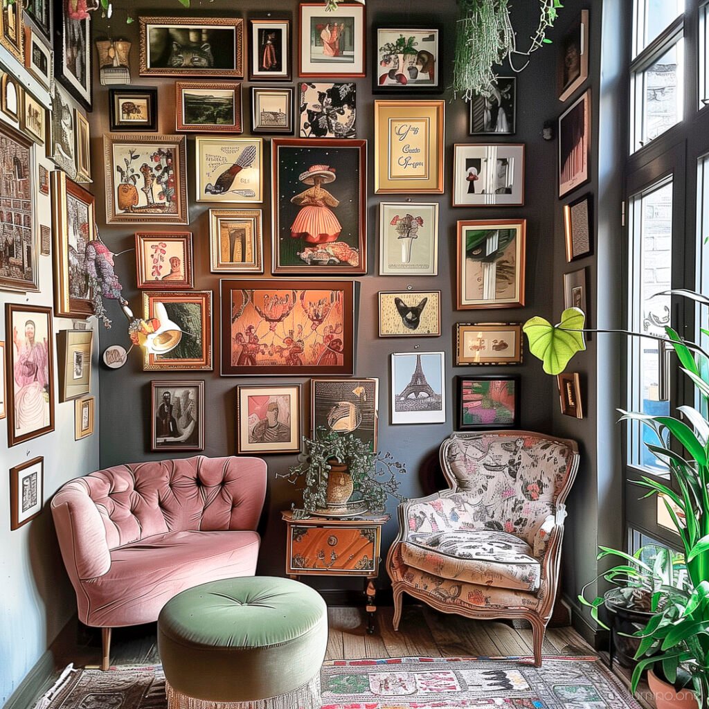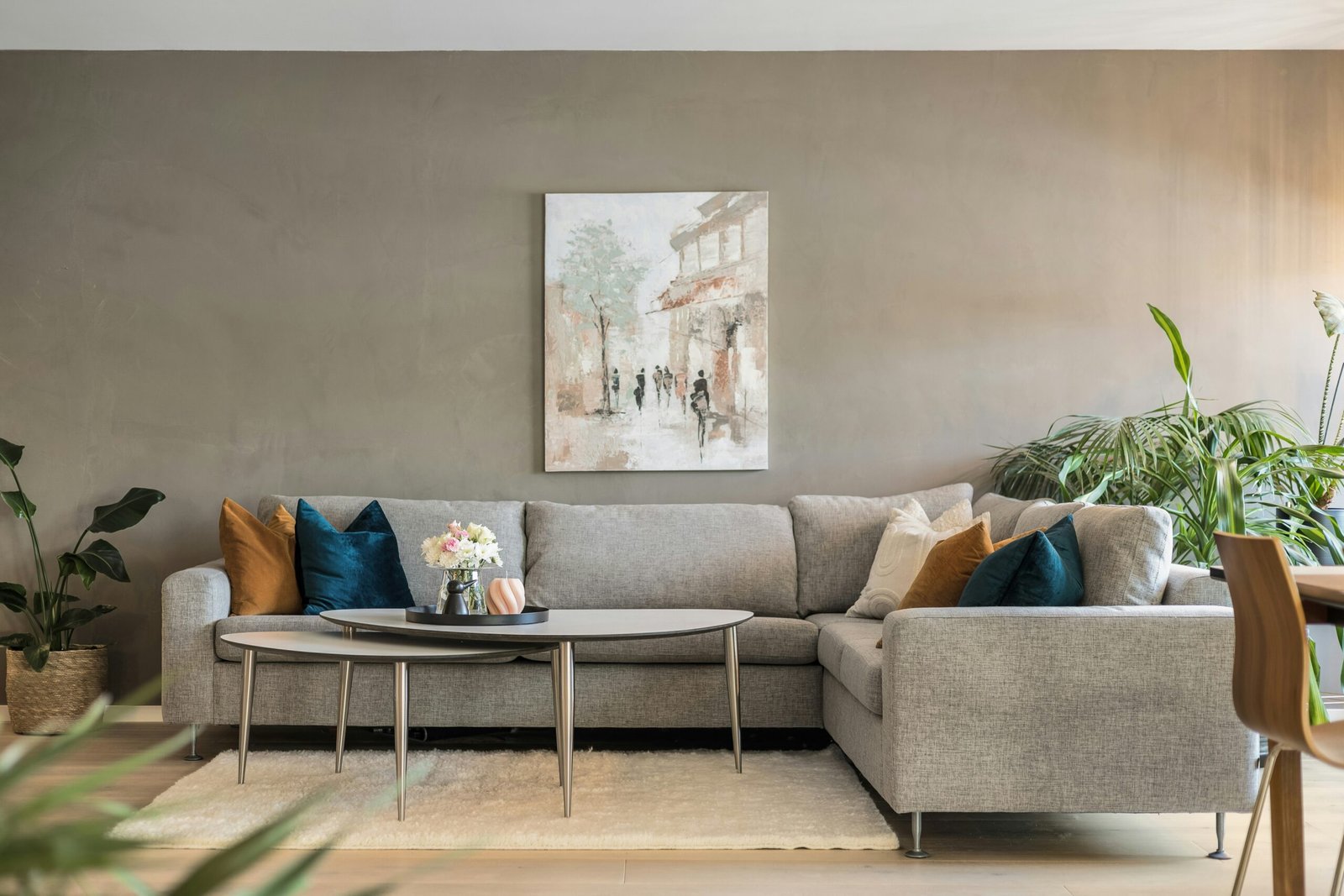
Walking into a room should feel like taking a deep breath – calm, balanced, and visually pleasing. Instead, do your walls currently scream for attention with competing artwork, creating visual chaos that makes you feel anxious rather than relaxed? You’re not alone in this common decorating dilemma.
Recent studies by the American Society of Interior Designers reveal that 73% of homeowners struggle with wall art placement, with overcrowding being the number one mistake that transforms beautiful spaces into cluttered disasters. The irony? Most people overcrowd their walls because they love art so much – yet this enthusiasm often destroys the very beauty they’re trying to create.
The good news is that mastering balanced wall art placement isn’t rocket science. With the right strategies, you can showcase your beloved collection while creating spaces that feel sophisticated, intentional, and breathtakingly beautiful. Today, you’ll discover the professional secrets that will save you from the overcrowding trap and transform your walls into curated masterpieces.
Why Overcrowded Walls Kill Your Room’s Potential
Before diving into solutions, let’s understand why overcrowded walls create such problems. When walls become too busy, they compete with your furniture, architectural features, and even natural light for attention. This visual competition creates what designers call “cognitive overload” – your brain simply can’t process all the information, leaving you feeling stressed rather than inspired.
Overcrowded walls also make rooms appear smaller and more chaotic, regardless of their actual size. According to feng shui principles widely adopted by interior designers, cluttered walls block positive energy flow and create feelings of restlessness. More practically, too much wall art makes cleaning difficult, increases maintenance needs, and often diminishes the impact of individual pieces you truly love.
Psychology research from Stanford University shows that people in visually cluttered environments experience increased cortisol levels – the stress hormone – compared to those in balanced, thoughtfully arranged spaces. Your wall art should enhance your life, not stress you out!
8 Professional Rules for Perfect Wall Art Balance
1. Master the Sacred White Space Principle
Professional designers swear by this fundamental rule: negative space is just as important as the art itself. Aim for 30-50% of your wall space to remain unadorned, creating visual breathing room that allows each piece to shine.
This doesn’t mean leaving walls completely bare – instead, think strategically about placement. If you have a 10-foot wall, don’t feel compelled to fill every inch. Choose fewer, larger pieces that make strong statements rather than numerous small pieces that create visual clutter.
2. Follow the “Rule of Odds” for Groupings
When creating gallery walls or grouping multiple pieces, stick to odd numbers – 3, 5, or 7 pieces work beautifully together. Even numbers tend to look formal and symmetrical, which can feel rigid, while odd numbers create more dynamic, visually interesting arrangements.
However, this rule has exceptions. Two matching pieces work perfectly on either side of a fireplace or bed, creating intentional symmetry. The key lies in understanding when to break rules purposefully versus accidentally.
3. Implement the Two-Thirds Coverage Rule
For walls above furniture, limit your art coverage to roughly two-thirds of the furniture’s width. If your sofa measures 8 feet wide, your wall art should span approximately 5-6 feet maximum. This proportion creates harmony between furniture and wall art while preventing the overwhelming look that destroys room balance.
This rule applies whether you’re using one large piece, multiple medium pieces, or a carefully curated gallery wall. The total visual weight should respect this proportion for optimal balance.
4. Create Clear Visual Hierarchies
Every room needs a focal point – one area that immediately draws the eye and establishes the space’s personality. Choose your most impactful artwork for this starring role, then select supporting pieces that complement rather than compete.
Your focal point might be a stunning large-scale painting above the fireplace, with smaller complementary pieces arranged on adjacent walls. Alternatively, create a show-stopping gallery wall on one feature wall while keeping other walls more minimal.
5. Maintain Consistent Spacing Standards
Professional galleries use 2-3 inches between framed pieces for good reason – this spacing allows each artwork to maintain its individual identity while contributing to a cohesive whole. Crowding pieces too closely together creates visual chaos, while spacing them too far apart breaks the connection between related works.
For gallery walls, cut paper templates of your frames and experiment with arrangements before making any holes. This planning prevents the all-too-common mistake of cramming pieces together because you’ve already committed to specific placements.
6. Consider Scale and Proportion Relationships
Mixing different sizes creates visual interest, but requires careful consideration of proportional relationships. Combine one large anchor piece with several smaller supporting pieces, ensuring the smaller works don’t get lost beside their larger companions.
Avoid placing tiny pieces next to enormous ones – the size difference will make small pieces disappear entirely. Instead, create gradual size transitions that guide the eye naturally through your arrangement.
7. Limit Your Color Palette for Cohesion
While your art collection might span every color imaginable, displaying everything simultaneously creates visual chaos. Instead, choose 3-4 dominant colors for each room, selecting pieces that work within this palette while allowing one or two accent colors for interest.
This doesn’t mean buying new art – simply rotate pieces seasonally or relocate colorful works to rooms where they fit better. Your goal is creating cohesive environments where each piece enhances the others rather than fighting for attention.
8. Use Lighting to Define and Separate
Strategic lighting helps define individual pieces while creating clear separations that prevent overcrowding appearance. Picture lights, track lighting, or even well-placed table lamps can highlight featured artwork while allowing other pieces to recede into supporting roles.
Proper lighting also helps smaller rooms feel larger by creating depth and dimension, counteracting the cramped feeling that overcrowded walls typically create.
Frequently Asked Questions
Step back and take photos of your rooms from different angles. If your eye doesn’t know where to rest, or if you feel overwhelmed rather than peaceful when entering the space, you likely have too much competing for attention.
Create a rotation system, storing some pieces and switching them seasonally. Alternatively, consider moving artwork to different rooms, gifting pieces to family members, or creating a dedicated gallery wall in a hallway or home office.
Absolutely! Successful gallery walls require careful planning, consistent themes (color, style, or subject matter), and respect for spacing rules. Limit gallery walls to one per room, and ensure surrounding walls remain more minimal.
Focus on quality over quantity in main living areas. Create a dedicated art room, use hallways for smaller pieces, or establish a rotation system that allows you to enjoy different pieces throughout the year.
Yes! Bare walls provide visual rest and can make architectural features, furniture, or statement pieces more impactful. Not every wall needs artwork – sometimes the most sophisticated choice is restraint.
Common Overcrowding Mistakes and How to Fix Them
Many homeowners fall into predictable traps when arranging wall art. The “postage stamp” mistake involves hanging multiple small pieces with too much space between them, making walls look sparse and disconnected. The solution? Group small pieces closer together to create one cohesive unit.
Another frequent error is the “museum wall” – covering every available inch with artwork of varying sizes, styles, and colors. While museums can pull this off with careful curation, home environments need more restraint to feel comfortable and livable.
The “height mishap” occurs when artwork hangs at inconsistent levels, creating a chaotic skyline that disturbs the eye’s natural flow. Maintain consistent hanging heights (57-60 inches to artwork centers) for professional-looking results.
Creating Your Perfect Wall Art Strategy
Start your transformation by removing all wall art from one room. Live with bare walls for a few days, noticing which walls feel most important and where your eye naturally goes. These observations will guide your reinstallation process.
Next, select your favorite 3-5 pieces for that room – resist the urge to include everything immediately. Arrange these carefully using the principles outlined above, paying attention to spacing, proportion, and visual flow.
Once you’re happy with this foundation, you can gradually add additional pieces if the room truly needs them. However, you might discover that less really is more, and your reduced selection has more impact than your previous overcrowded arrangement.
Transform Your Space With Intentional Restraint
The path to beautiful, balanced walls isn’t about owning less art – it’s about displaying your collection more thoughtfully. When you respect the principles of visual balance, spacing, and hierarchy, every piece in your collection gets the attention it deserves while contributing to an overall sense of harmony and sophistication.
Remember, your home should be a sanctuary that reflects your personality while providing visual rest from the world’s chaos. Overcrowded walls work against this goal, creating stress instead of serenity. By implementing these professional strategies, you’re not just improving your decor – you’re creating environments that support your wellbeing and showcase your style beautifully.
Start today with one room, one wall, or even one small adjustment. The transformation begins with a single intentional choice, and before you know it, you’ll have the sophisticated, gallery-worthy spaces you’ve always admired.

