Pair wall art wooden furniture requires understanding fundamental design principles that create harmonious relationships between natural wood tones and artistic elements. The challenge lies in balancing warm wood undertones with artwork colors while maintaining visual cohesion that feels intentional rather than accidentally assembled through trial and error approaches.
Wooden furniture brings organic warmth and natural texture to interior spaces, creating foundations that require thoughtful artistic selections to enhance rather than compete with these inherent characteristics. Wooden furniture art coordination involves understanding wood species, grain patterns, and finish variations that influence how different artworks interact with these natural elements throughout various lighting conditions.
Understanding Wood Characteristics for Art Selection
Wood Tone Analysis and Color Temperature
Different wood species exhibit distinct undertones that dramatically influence artwork compatibility and overall room harmony. Cherry and mahogany display warm red undertones, while maple and ash lean toward cooler yellow or gray characteristics that require different artistic approaches for successful coordination.
The key to successful pairing lies in identifying these subtle color variations before selecting artwork, as mismatched temperatures create visual discord that undermines both furniture investment and artistic impact. Warm woods pair beautifully with artwork featuring similar temperature ranges, while cooler woods benefit from complementary artistic selections.
Interior design experts recommend testing artwork against furniture under various lighting conditions, as natural and artificial light sources can dramatically alter perceived color relationships throughout different times of day and seasonal variations.
Grain Pattern Considerations
Wood grain patterns create natural texture that competes with busy or highly detailed artwork for visual attention. Heavily grained woods like oak or ash work best with simpler, more minimalist artistic selections that allow natural wood beauty to remain the primary textural focus.
Conversely, furniture with subtle grain patterns or painted finishes can accommodate more complex artwork without creating overwhelming visual competition. Understanding this balance prevents rooms from feeling chaotic or overstimulated through conflicting pattern interactions.
Consider how grain directions interact with artwork orientations—vertical grain patterns complement horizontal artwork compositions while diagonal or swirled grains work well with abstract or organic artistic forms that echo natural wood movement patterns.
Strategic Color Coordination Techniques
Complementary Color Relationships
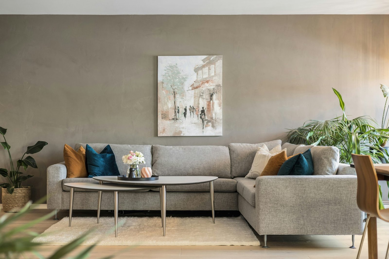
Wooden furniture art coordination benefits from understanding color wheel relationships that create dynamic yet harmonious combinations. Warm wood tones pair beautifully with cool blues and greens that provide refreshing contrast without clashing with natural wood characteristics.
Orange-toned woods like pine or cedar create stunning combinations with deep blues or soft turquoise artwork that enhances warmth while preventing spaces from feeling monotonous or overly earthy. These complementary relationships energize rooms while maintaining sophisticated balance.
Color theory research demonstrates that complementary color combinations increase visual interest by 40% while maintaining harmony when properly balanced through appropriate saturation and value relationships in both furniture and artistic elements.
Analogous Harmony Strategies
Analogous color schemes use adjacent colors on the color wheel to create peaceful, cohesive environments that feel naturally balanced. This approach works particularly well when you want to pair wall art wooden furniture without dramatic contrast or bold statement making.
Warm woods coordinate beautifully with artwork featuring oranges, yellows, and warm browns that extend the natural color family while adding depth and variation. This technique creates sophisticated, spa-like environments that promote relaxation and comfort.
Cool-toned woods benefit from artwork in blue, green, and purple families that maintain temperature consistency while providing enough variation to prevent monotony in carefully curated interior spaces.
Scale and Proportion Guidelines
Furniture Size Relationships
The scale relationship between wooden furniture and wall artwork determines visual balance and determines whether combinations feel proportional or awkward. Large furniture pieces require substantial artwork to maintain visual weight balance, while delicate pieces pair better with smaller, more intimate artistic selections.
Dining tables and entertainment centers benefit from artwork spanning 60-75% of the furniture width to create pleasing proportional relationships that feel intentionally designed rather than accidentally placed through convenience or availability.
Consider vertical relationships as well—tall bookcases or armoires can accommodate multiple smaller pieces or single large vertical compositions that complement rather than compete with furniture height and mass.
Room Scale Considerations
Room proportions influence how furniture and artwork relationships appear within broader spatial contexts. Small rooms benefit from coordinated selections that create visual continuity, while larger spaces can accommodate more dramatic contrasts and bold artistic statements.
Wooden furniture art coordination must account for viewing distances and sight lines that determine how pieces interact from various room positions. Artwork visible from seating areas requires different considerations than pieces viewed primarily in passing.
Space planning principles suggest that successful furniture and art combinations consider the room’s primary function and traffic patterns to ensure aesthetic choices support rather than hinder daily living activities.
Lighting Impact on Wood and Art Combinations
Natural Light Variations
Natural lighting dramatically affects how wood tones and artwork colors interact throughout daily cycles and seasonal changes. Morning light emphasizes cool undertones while afternoon sun brings out warm characteristics that can completely transform perceived color relationships.
Windows facing different directions create varying light qualities that influence artwork selection strategies. North-facing rooms receive consistent cool light that favors certain wood and art combinations, while south-facing spaces get warm, changing light requiring more flexible artistic choices.
Consider how seasonal light variations affect your carefully planned combinations, as autumn and winter light can make summer color selections appear dramatically different when natural lighting conditions change significantly.
Artificial Lighting Strategies
Strategic artificial lighting enhances both wooden furniture characteristics and artistic elements through proper illumination that brings out desired color relationships while minimizing problematic interactions. Warm LED lights enhance wood beauty while cool lights can wash out natural warmth.
Track lighting or picture lights allow independent control over artwork illumination, ensuring pieces maintain intended color relationships regardless of general room lighting conditions throughout different times of day or evening entertainment needs.
Lighting design experts recommend layered lighting approaches that provide flexibility for different activities while maintaining consistent aesthetic relationships between wooden furniture and coordinated wall artwork selections.
Style Integration Methods
Traditional and Classic Approaches
Traditional wooden furniture styles like Queen Anne or Chippendale pair beautifully with classic artwork including landscape oil paintings, portraits, or botanical prints that echo historical periods and design sensibilities. These combinations create sophisticated, timeless environments that appreciate in both beauty and value.
Rich, dark woods benefit from artwork with substantial frames and traditional subject matters that complement formal furniture styling while maintaining appropriate visual weight and cultural consistency throughout carefully curated interior environments.
Consider gilded frames or traditional matting techniques that bridge wooden furniture formality with artistic presentation standards that maintain period authenticity and sophisticated aesthetic appeal.
Contemporary and Modern Integration
Modern wooden furniture with clean lines and minimal ornamentation provides versatile backdrops for contemporary artistic expressions including abstract paintings, modern photography, or sculptural installations that complement rather than compete with simplified furniture forms.
Light woods like maple or birch work exceptionally well with bold contemporary artwork that provides color and visual interest without overwhelming clean furniture lines or geometric forms typical of modern design approaches.
Pair wall art wooden furniture successfully in contemporary settings by maintaining consistent design philosophies that emphasize simplicity, functionality, and aesthetic clarity throughout coordinated interior environments.
Budget-Conscious Coordination Strategies
Affordable Art Solutions
High-quality prints and reproductions provide access to museum-quality artwork at accessible price points that complement expensive wooden furniture investments without requiring additional major financial commitments for complete room coordination.
Online art marketplaces offer extensive selections of affordable prints specifically designed to coordinate with wooden furniture characteristics, providing options for various wood tones, room sizes, and personal style preferences.
Consider rotating artwork seasonally to provide visual variety while maximizing investment value from both furniture and artistic elements throughout changing design preferences and lifestyle evolution.
DIY and Custom Options
Personal photography and DIY artwork creation provide unique solutions perfectly tailored to specific wooden furniture characteristics and room requirements that commercial options might not address adequately for individualized design needs.
Nature photography featuring wood textures, forest scenes, or botanical subjects creates natural connections with wooden furniture while providing personalized artistic expression that reflects individual taste and environmental appreciation.
Digital printing services enable custom sizing and material selection that ensures perfect proportional relationships with existing furniture while maintaining professional presentation quality standards.
Maintenance and Longevity Considerations
Preservation Strategies
Proper placement protects both wooden furniture and artwork from environmental damage while maintaining intended aesthetic relationships over extended periods. Avoid direct sunlight that can fade both wood finishes and artistic materials simultaneously.
Climate control prevents warping, cracking, or color changes that can disrupt carefully planned design coordination between furniture and artwork elements. Consistent temperature and humidity levels preserve both investments effectively.
Regular cleaning and maintenance schedules ensure continued beauty and value preservation for both wooden furniture and coordinated artwork throughout years of enjoyment and daily living activities.
Adaptation Over Time
Design flexibility allows for artwork changes as personal tastes evolve while maintaining wooden furniture investments that provide long-term value and foundational design elements for multiple decorating phases throughout homeownership.
Consider neutral wooden furniture selections that accommodate various artistic styles and color preferences throughout changing life circumstances and evolving aesthetic preferences over time.
Frequently Asked Questions
Dark woods like walnut or cherry pair beautifully with light, cool-toned artwork including soft blues, sage greens, or warm whites that create striking contrast without overwhelming the wood’s natural richness. Avoid very dark artwork that disappears against dark furniture, and consider pieces with metallic accents that add brightness and visual interest.
Frames don’t need to match exactly but should complement the wood’s temperature and formality level. Warm woods work well with brass, gold, or warm wood frames, while cool woods pair nicely with silver, black, or cool wood tones. The key is maintaining consistent design philosophy rather than exact color matching.
Light woods like pine, maple, or birch provide versatile backdrops that accommodate both bold and subtle artwork. Consider the room’s overall color scheme and your desired energy level—bright, colorful pieces create vibrant environments while neutral artwork maintains calm, sophisticated atmospheres.
Yes, but maintain consistency through either color temperature or style approach. Mixed wood tones work when they share similar undertones, and varied artwork succeeds when pieces share common elements like color palette, subject matter, or framing approach that creates visual unity despite diversity.
Conclusion
Pair wall art wooden furniture successfully by understanding wood characteristics, color relationships, and scale proportions that create harmonious interior environments. These eight strategies provide frameworks for making confident decisions that enhance both furniture investments and artistic selections.
Pair wall art wooden furniture combinations thrive when they balance natural wood beauty with complementary artistic elements that support rather than compete with each other for visual attention throughout beautifully coordinated living spaces./isolated-segment.html