Creating harmonious interiors requires mastering the delicate balance between artwork and existing color schemes throughout your living spaces. Matching wall art colors transforms ordinary rooms into sophisticated environments where every element works together seamlessly, creating visual flow and emotional resonance that elevates your home’s overall aesthetic appeal.
Professional interior designers consistently emphasize that successful color coordination between artwork and room palettes forms the foundation of exceptional design. Whether you’re working with bold contemporary pieces or subtle traditional paintings, understanding color relationships ensures your artistic choices enhance rather than compete with your carefully curated interior elements.
The secret lies in recognizing how colors interact, complement, and contrast within different lighting conditions and spatial contexts. From analyzing undertones to implementing strategic accent placements, effective color matching creates cohesive environments that feel intentionally designed rather than accidentally assembled.
Understanding Color Theory Fundamentals for Interior Design
Color theory provides the scientific foundation for all successful interior design decisions, offering clear guidelines for creating harmonious relationships between artwork and existing room elements. The color wheel serves as your essential tool, illustrating primary, secondary, and tertiary colors alongside their natural relationships and interactions.
Complementary colors sit opposite each other on the wheel, creating dynamic contrast that energizes spaces when used thoughtfully. Meanwhile, analogous colors neighbor each other, providing gentle harmony that soothes and unifies room aesthetics. Understanding these basic principles empowers homeowners to make confident artistic selections.
Temperature considerations play equally important roles in color matching decisions. Warm colors like reds, oranges, and yellows create cozy, intimate atmospheres, while cool blues, greens, and purples promote calm, spacious feelings. Balancing warm and cool elements throughout your space creates visual interest without overwhelming sensory experiences.
Identifying Undertones in Your Existing Palette
Undertones significantly impact how colors appear under different lighting conditions and alongside various materials. Even seemingly neutral whites and grays contain subtle warm or cool undertones that influence their compatibility with potential artwork selections.
Natural lighting reveals true color characteristics, making it essential to evaluate both your existing palette and potential artwork under daylight conditions. Artificial lighting can dramatically alter color perceptions, sometimes creating unexpected clashes between elements that appeared harmonious under different illumination.
Professional color consultations often begin with undertone analysis, as these subtle influences determine whether color combinations feel cohesive or discordant. The Pantone Color Institute provides excellent resources for understanding color relationships and seasonal color trends.
Strategic Approaches for Matching Wall Art Colors
Monochromatic schemes use varying shades, tints, and tones of single colors to create sophisticated, cohesive environments. This approach works exceptionally well for matching wall art colors because it eliminates the complexity of balancing multiple hues while allowing for rich textural and tonal variations.
Consider selecting artwork that features your room’s primary color in different intensities or applications. For example, a blue-dominated living room might showcase artwork ranging from deep navy abstracts to soft powder blue landscapes, creating visual depth while maintaining color harmony.
Triadic color schemes employ three equally spaced colors from the wheel, offering more variety while maintaining balance. This approach allows for dynamic artwork selections that introduce additional colors without disrupting your room’s overall harmony.
Creating Accent Color Strategies
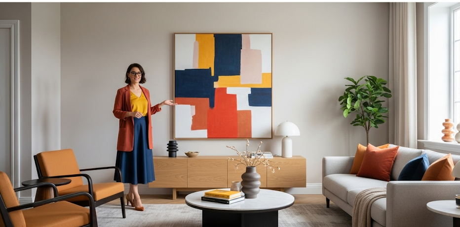
Accent colors typically comprise 10-20% of your overall color scheme, making them perfect vehicles for introducing artwork that adds personality without overwhelming existing elements. Strategic accent placement through wall art creates focal points that guide visual flow throughout your space.
Metallic accents in frames or artwork elements can bridge different color temperatures while adding luxury and sophistication to your overall design scheme. Gold complements warm palettes beautifully, while silver and chrome enhance cool color schemes effectively.
Seasonal accent rotation allows you to refresh your space’s appearance without major renovations. Summer might feature bright coral or turquoise accents, while winter welcomes deep burgundy or forest green elements that create cozy, intimate atmospheres.
Room-Specific Color Matching Strategies
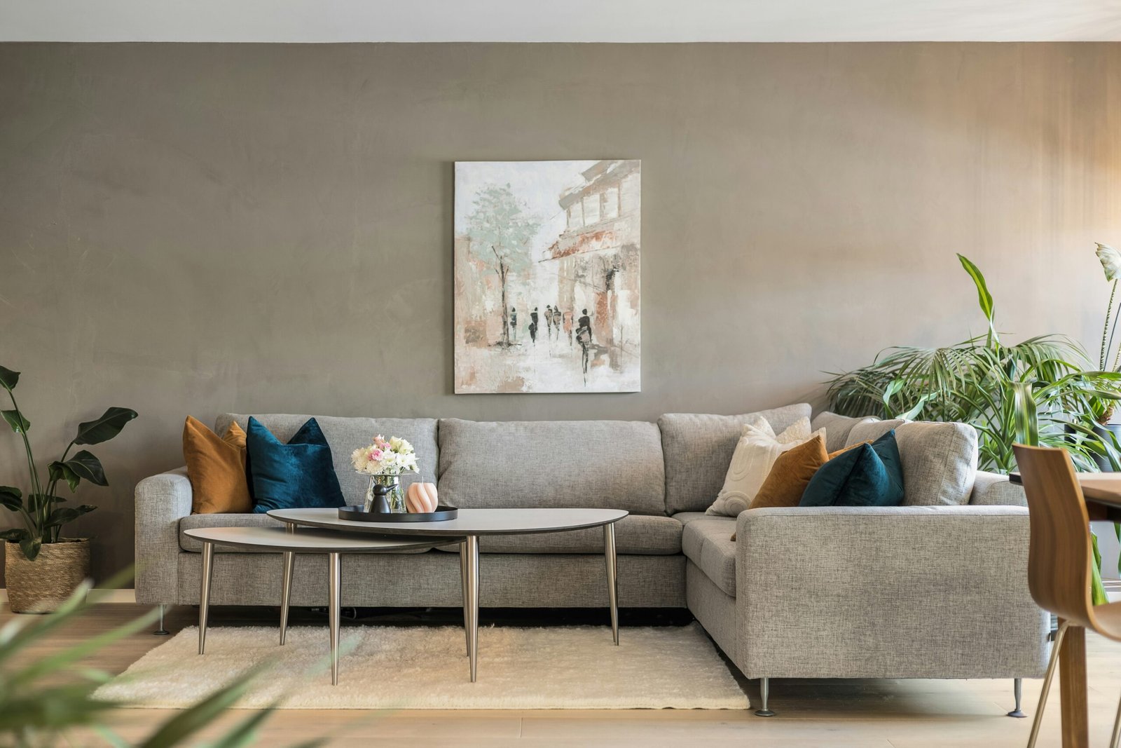
Living rooms benefit from artwork that reflects the space’s primary function as social gathering areas. Warm, inviting colors encourage conversation and relaxation, while cooler tones create sophisticated atmospheres suitable for formal entertaining or quiet contemplation.
Consider your furniture’s existing colors when selecting living room artwork. Neutral sofas provide flexible backdrops for bold artistic statements, while colorful upholstery requires more careful coordination to prevent visual competition between elements.
Traffic flow influences color perception in living areas, as artwork will be viewed from multiple angles and distances. Ensure your color choices remain harmonious from various vantage points throughout the room.
Bedroom Color Harmony for Restful Environments
Bedrooms require careful attention to matching wall art colors that promote relaxation and peaceful sleep. Cool blues and greens naturally lower blood pressure and heart rate, making them excellent choices for restful environments.
Avoid overly stimulating colors like bright reds or oranges in bedroom artwork, as these energizing hues can interfere with natural sleep patterns. Instead, opt for muted versions or use these colors sparingly as small accent elements.
Personal preference plays a larger role in bedroom color selection since these private spaces reflect individual taste more than public areas. The Color Marketing Group offers insights into color psychology and residential applications.
Kitchen and Dining Area Color Coordination
Kitchen color schemes often center around cabinetry, countertops, and backsplash elements, creating established palettes that artwork must complement rather than compete against. Food-related imagery works naturally in these spaces while requiring careful color coordination with existing finishes.
Dining areas benefit from artwork that enhances appetite and promotes social interaction. Warm colors like deep reds, golden yellows, and rich oranges create inviting atmospheres that encourage lingering over meals and conversations.
Consider how cooking activities and meal lighting affect color perception throughout different times of day. Artwork that looks perfect under morning sunlight might appear dramatically different under evening pendant lighting during dinner gatherings.
Bathroom Color Matching for Spa-Like Retreats
Bathroom environments present unique challenges for matching wall art colors due to moisture concerns, limited space, and specific functional requirements. Spa-inspired palettes featuring soft blues, greens, and earth tones create calming retreats that promote relaxation and rejuvenation.
Humidity-resistant artwork materials become essential considerations alongside color coordination. Canvas prints with protective coatings or framed pieces with moisture-resistant backing ensure longevity while maintaining color integrity over time.
Scale relationships matter significantly in smaller bathroom spaces where artwork must provide visual interest without overwhelming limited square footage. Lighter colors help expand perceived space while darker hues can make small bathrooms feel cramped.
Professional Color Matching Techniques
Digital color matching tools simplify the process of identifying exact color values within existing room elements, allowing precise coordination with potential artwork selections. Smartphone apps and online tools can extract specific color codes from photographs of your space.
Paint sample coordination provides tangible references for artwork shopping, ensuring color accuracy that might be difficult to assess from digital displays alone. Collect samples of your room’s primary colors to carry during gallery visits or online browsing sessions.
Professional consultation services offer expert guidance for complex color coordination challenges, particularly in homes with multiple connected living areas requiring visual flow between spaces. Interior designers understand how colors interact across different lighting conditions and spatial relationships.
Lighting Considerations for Color Accuracy
Natural lighting changes throughout the day, affecting how artwork colors appear in relation to your existing palette. North-facing rooms receive cooler light that enhances blues and greens, while south-facing spaces get warmer illumination that intensifies reds and yellows.
Artificial lighting choices significantly impact color perception and coordination success. LED bulbs offer adjustable color temperatures that can be customized to enhance your artwork’s appearance while maintaining harmony with surrounding elements.
Gallery lighting techniques borrowed from museums can showcase your artwork while ensuring accurate color representation. Track lighting systems allow precise control over illumination angles and intensity levels.
Frequently Asked Questions
Focus on your room’s dominant color (typically comprising 60-70% of the space) as your primary coordination point. Select artwork that either complements this main color or introduces controlled contrast through its secondary colors. Ensure any new colors you introduce appear in at least two other room elements to maintain visual balance.
Yes, but limit new color introductions to 10-20% of your overall scheme to maintain harmony. When introducing new colors through artwork, echo these hues in smaller accessories like throw pillows, candles, or decorative objects to create visual connections throughout the space.
Create color flow between connected spaces by selecting artwork that shares common color elements while allowing each area to maintain its distinct personality. Use varying intensities or applications of your core colors rather than exact matches to create subtle transitions between zones.
Multi-colored artwork can work beautifully if you identify its dominant color and ensure it harmonizes with your existing palette. Pull 2-3 secondary colors from the piece to inform your room’s accent choices, creating intentional connections that unify the overall design scheme.
Mastering Color Coordination for Stunning Results
Matching wall art colors with your interior palette requires understanding color relationships, undertone recognition, and strategic planning that considers lighting, scale, and room function. Success lies in balancing harmony with visual interest, creating spaces that feel both cohesive and dynamic.
Remember that color coordination is both art and science, combining technical knowledge with personal aesthetic preferences. Start with small steps, experiment with temporary solutions, and gradually build confidence in your color matching abilities to create the beautiful, harmonious spaces you envision.