Match wall art colors with your paint choices can transform ordinary rooms into extraordinary designer spaces that radiate harmony and sophistication. Understanding how to create seamless color relationships between artwork and wall surfaces represents one of the most impactful skills in interior design, yet many homeowners struggle with this crucial element.
The secret lies in mastering color theory principles while considering lighting conditions, room proportions, and personal style preferences that influence how colors interact within your specific space. Professional interior designers rely on proven techniques that ensure artwork enhances rather than competes with wall colors, creating color harmony interior design that feels intentional and polished rather than accidental or chaotic.
Understanding Color Theory for Wall Art Colors
Primary Color Relationships
The foundation of successful color matching begins with understanding how primary colors—red, blue, and yellow—interact with their secondary and tertiary variations. These relationships determine whether your artwork will complement or clash with surrounding wall colors, making color wheel knowledge essential for achieving professional results.
Complementary colors sit opposite each other on the color wheel and create dynamic contrast when used together. For example, blue artwork against orange-toned walls creates vibrant energy, while analogous colors (those adjacent on the wheel) produce calming, harmonious effects that feel naturally balanced.
Professional color consultants emphasize that understanding these relationships helps homeowners make confident decisions about artwork placement and wall color selections that enhance rather than detract from overall design goals.
Temperature Considerations in Color Coordination
Warm colors—reds, oranges, and yellows—advance visually and create cozy, intimate atmospheres, while cool colors—blues, greens, and purples—recede and make spaces feel larger and more serene. Successfully matching wall art colors requires balancing these temperature characteristics to achieve desired emotional responses.
Rooms with predominantly warm wall colors benefit from artwork that either continues the warm theme for cohesion or introduces cool accents for sophisticated contrast. Conversely, cool wall colors pair beautifully with warm artwork that adds energy and visual interest without overwhelming the space’s tranquil foundation.
Understanding temperature relationships helps you create intentional moods while maintaining visual balance that feels professionally curated rather than randomly assembled through trial and error approaches.
Strategic Techniques to Match Wall Art Colors
The 60-30-10 Rule Application
Professional designers rely on the 60-30-10 color distribution rule to create balanced, visually pleasing interiors where artwork integrates seamlessly with wall colors. This principle allocates 60% to dominant colors (typically walls), 30% to secondary colors (furniture and larger accessories), and 10% to accent colors (artwork and decorative elements).
When applying this rule to match wall art colors, your artwork should either reinforce the dominant wall color through similar tones or provide the accent color that adds visual interest without overwhelming the established color scheme. This mathematical approach removes guesswork while ensuring professional-looking results.
Interior design studies confirm that rooms following the 60-30-10 rule receive higher satisfaction ratings from both inhabitants and visitors, demonstrating the effectiveness of this time-tested color distribution strategy.
Neutral Base Strategy
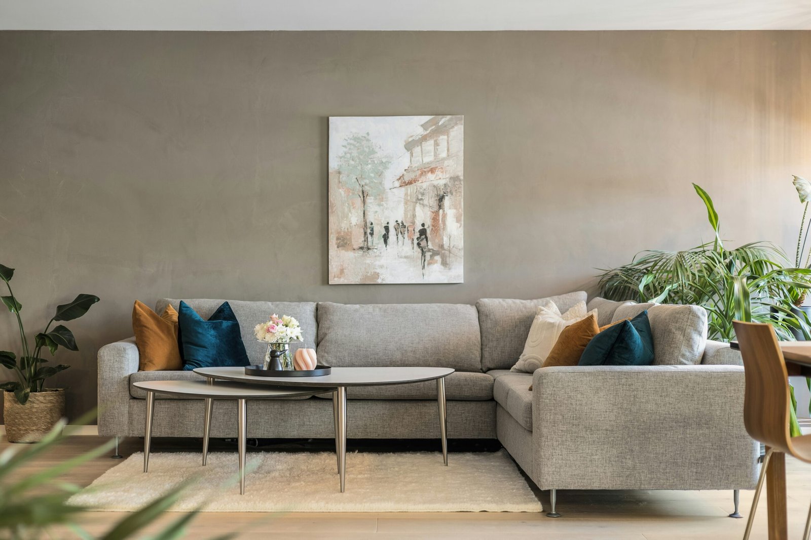
Neutral wall colors—whites, grays, beiges, and greiges—provide versatile backdrops that allow artwork to shine without color competition. This approach offers maximum flexibility for changing artwork while maintaining cohesive room aesthetics that adapt to evolving tastes and seasonal preferences.
When working with neutral walls, color harmony interior design becomes primarily about artwork selection rather than complex color matching calculations. Bold, colorful pieces create dramatic focal points, while monochromatic artwork maintains sophisticated, gallery-like atmospheres that feel timeless and elegant.
Neutral backgrounds also simplify the process of building art collections over time, as new pieces integrate easily without requiring wall color changes or extensive room redesigning that limits future decorating flexibility.
Advanced Color Matching Techniques
Monochromatic Schemes for Sophisticated Appeal
Monochromatic color schemes use variations of single colors to create sophisticated, cohesive environments where artwork and walls work together harmoniously. This approach involves selecting artwork that features different shades, tints, and tones of your wall color for seamless integration.
For instance, if you have sage green walls, choose artwork featuring forest greens, mint greens, or olive variations that maintain color family consistency while providing visual depth and interest. This technique creates calm, unified spaces that feel professionally designed.
Color psychology research indicates that monochromatic rooms reduce visual stress and promote relaxation, making this approach particularly effective for bedrooms, bathrooms, and other spaces designated for rest and rejuvenation.
Accent Color Coordination Methods
Strategic accent color coordination involves selecting artwork that introduces or reinforces secondary colors found elsewhere in your room—throw pillows, rugs, or furniture upholstery. This technique creates visual connections that tie design elements together cohesively.
To match wall art colors using this method, identify existing accent colors in your space and choose artwork featuring those same hues. This approach ensures your art collection integrates seamlessly with overall room design rather than appearing randomly placed or disconnected from surrounding elements.
Consider seasonal accent color rotations that allow you to refresh room aesthetics by changing artwork while maintaining established wall colors, providing variety without major redecorating investments or permanent color commitments.
Lighting Impact on Color Harmony Interior Design
Natural Light Considerations
Natural light significantly affects how colors appear throughout the day, making it crucial to evaluate artwork and wall color combinations under various lighting conditions. North-facing rooms receive cool, consistent light that emphasizes blue undertones, while south-facing rooms get warm, changing light that enhances yellow and red undertones.
When planning to match wall art colors, observe your space at different times of day to understand how lighting affects color perception. Colors that appear harmonious in morning light might clash under afternoon or evening conditions, requiring adjustments to maintain consistent aesthetic appeal.
Professional designers recommend testing color combinations for at least 24 hours before making final decisions, allowing you to observe how changing light conditions affect the relationship between artwork and wall colors throughout complete daily cycles.
Artificial Lighting Effects
Different artificial light sources—LED, fluorescent, incandescent—cast various color temperatures that influence how wall art colors interact with paint selections. Warm LED bulbs enhance reds and yellows while muting blues, whereas cool LED lights do the opposite.
Plan your color matching strategy considering your primary lighting sources to ensure artwork and walls maintain intended relationships under typical viewing conditions. This foresight prevents disappointing results that occur when color combinations work in store lighting but fail in your home environment.
Lighting design experts recommend using full-spectrum bulbs for art display areas, as these provide the most accurate color representation and maintain true color relationships between artwork and surrounding wall surfaces.
Frequently Asked Questions
Exact color matching often creates flat, monotonous appearances lacking visual interest. Instead, choose artwork that complements your wall colors through harmonious relationships—similar undertones, complementary contrasts, or analogous color schemes that create depth while maintaining cohesion for more dynamic, professionally designed aesthetics.
Bold wall colors require careful artwork selection to avoid visual competition. Choose pieces with neutral backgrounds and subtle color accents, or select artwork featuring colors directly opposite your wall color on the color wheel for sophisticated contrast that creates focal points without overwhelming the space.
Absolutely! Mixing warm and cool colors creates visual interest and prevents monotonous color schemes. The key is maintaining balance—if your walls are cool-toned, choose artwork with predominantly cool colors but warm accents, or vice versa. This approach adds energy while preserving overall color harmony.
Choose neutral wall colors that provide versatile backgrounds for rotating artwork collections. Grays, whites, and beiges accommodate various color schemes and artistic styles, allowing you to refresh your space seasonally or as tastes evolve without requiring wall repainting or major design overhauls.
Conclusion
Successfully learning to match wall art colors with paint requires understanding color theory fundamentals, applying professional techniques like the 60-30-10 rule, and considering lighting impacts on color perception. These strategies transform challenging color coordination tasks into manageable, enjoyable design processes that yield professional-quality results.
Match wall art colors with confidence by experimenting with monochromatic schemes, accent color coordination, and neutral backgrounds that provide flexibility for future changes. Remember that perfect color harmony comes from practice and observation rather than rigid rules, allowing your personal style to shine through thoughtful color relationships.