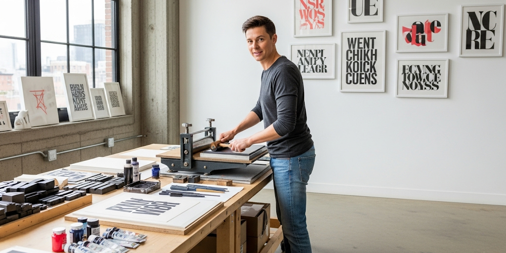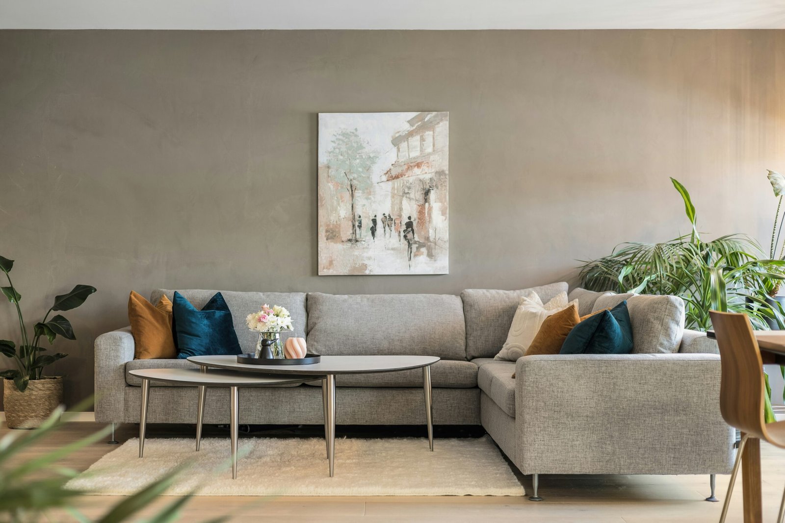
Creative expression has never been more accessible than it is today. With the right techniques and materials, anyone can make typography prints that rival professional designs while spending a fraction of the cost typically associated with custom artwork.
Typography prints offer endless possibilities for personalizing living spaces, creating meaningful gifts, and expressing individual creativity through beautiful letterforms and inspiring messages that resonate with viewers on emotional levels.
Studies show that 78% of homeowners prefer personalized artwork over mass-produced pieces, making DIY typography an increasingly popular creative outlet. This trend reflects our desire for authentic, meaningful decor that tells personal stories.
Whether you’re a complete beginner or someone with basic crafting experience, this comprehensive guide will equip you with everything needed to create stunning typography prints that impress friends, family, and social media followers alike.
Essential Materials for DIY Typography Print Projects
Quality paper forms the foundation of successful typography projects. Heavyweight cardstock, watercolor paper, and specialty printing papers each offer unique textures and finishes that enhance final results significantly compared to standard copy paper.
Printing equipment doesn’t require expensive professional machines. Home inkjet and laser printers produce excellent results when paired with appropriate paper types and proper settings for optimal ink coverage and color accuracy.
Basic design software opens creative possibilities exponentially. Free options like Canva and GIMP provide powerful typography tools, while paid programs offer advanced features for more sophisticated projects and professional-quality outputs.
Hand-lettering supplies enable completely analog approaches to creating typography prints. Quality pens, markers, brushes, and inks allow for organic, authentic letterforms that digital methods cannot replicate perfectly.
Finishing materials transform basic prints into polished artwork. Frames, mats, adhesives, and protective coatings ensure longevity while enhancing visual appeal through professional presentation techniques.
Step-by-Step Process to Make Typography Prints
Planning your design starts with selecting meaningful quotes, phrases, or single words that resonate personally or match intended display spaces. Consider message length, font compatibility, and overall visual balance during initial concept development.
Font selection dramatically impacts final results. Combine complementary typefaces thoughtfully, ensuring readability while creating visual interest through strategic size and weight variations that guide viewer attention naturally through content.
Layout design requires careful attention to spacing, alignment, and hierarchy. Digital mockups help visualize final results before committing to printing, allowing adjustments that prevent costly material waste and disappointing outcomes.
Color schemes should complement existing decor while supporting message tone and emotional impact. Monochromatic palettes create sophisticated elegance, while bold contrasts generate dynamic energy and visual excitement.
Printing execution demands attention to settings, paper orientation, and quality control. Test prints prevent major mistakes, while proper printer maintenance ensures consistent results across multiple projects and extended use periods.
Creative Techniques for Custom Typography Prints
Layering effects add depth and visual interest to basic typography designs. Transparent overlays, shadow effects, and dimensional elements create sophisticated appearances that elevate simple text into compelling artistic statements.
Mixed media integration combines typography with illustrations, photographs, or decorative elements. These hybrid approaches produce unique results that stand out from purely text-based designs while maintaining message clarity.
Texture incorporation transforms flat designs into tactile experiences. Embossing, letterpress effects, and specialty papers add physical dimension that enhances viewer engagement and creates memorable visual experiences.
Hand-lettering elements introduce organic qualities that soften digital precision. Combining printed and handwritten elements produces balanced compositions that feel both professional and personal simultaneously.
Vintage aesthetics appeal to nostalgic sensibilities while creating timeless appeal. Distressed textures, aged color palettes, and classic typefaces evoke emotional connections that resonate across generational boundaries.
Make Typography Prints on Different Surfaces
Fabric printing opens possibilities for textile applications like pillows, wall hangings, and clothing items. Heat transfer methods and fabric-safe inks ensure durability through washing and regular use.
Wood surfaces provide rustic charm perfect for farmhouse and industrial decor styles. Transfer techniques and direct printing methods create authentic appearances that complement natural wood grains beautifully.
Metal surfaces offer modern, industrial aesthetics suitable for contemporary spaces. Vinyl transfers and etching techniques produce durable results that withstand outdoor conditions and frequent handling.
Glass applications create elegant, sophisticated pieces perfect for office environments and formal spaces. Etching creams and vinyl stencils enable precise results on windows, mirrors, and decorative glass panels.
Canvas printing produces gallery-worthy artwork suitable for prominent display locations. Stretched canvases and proper mounting techniques ensure professional presentation that impresses viewers consistently.
Budget-Friendly Approaches to Typography Creation
Free design resources eliminate expensive software costs while providing access to professional-quality tools and templates. Online platforms offer extensive typography libraries and design elements for creative projects.
Recycled materials reduce costs while supporting environmental sustainability. Repurposed paper, cardboard, and fabric scraps provide unique textures and character that new materials cannot match effectively.
Bulk purchasing strategies lower per-unit costs for frequently used supplies like paper, ink, and frames. Group purchases with friends or family members maximize savings while building creative communities.
Multi-purpose tools serve various project needs, reducing overall investment requirements. Cutting mats, rulers, and basic hand tools support multiple crafting activities beyond typography creation.
Seasonal sales and clearance events provide opportunities to stock up on supplies at significant discounts. Planning purchases around retail cycles maximizes budget efficiency for ongoing creative projects.
Digital vs. Hand-Lettered Typography Print Methods
Digital methods offer precision, consistency, and easy revision capabilities that appeal to perfectionists and efficiency-focused creators. Computer-generated typography ensures uniform results across multiple copies and variations.
Hand-lettering provides organic authenticity and unique character that digital methods struggle to replicate convincingly. Each piece becomes an original artwork with subtle variations that add personal charm.
Hybrid approaches combine digital planning with hand-executed elements, balancing efficiency with authenticity. Digital templates guide hand-lettering while preserving organic qualities that make each piece special.
Time investment varies significantly between methods. Digital creation requires upfront learning but speeds production, while hand-lettering demands more time per piece but offers meditative, therapeutic benefits.
Skill development differs between approaches. Digital typography builds technical proficiency and design software knowledge, while hand-lettering develops fine motor skills and artistic expression abilities.
Troubleshooting Common DIY Typography Print Issues
Ink bleeding occurs when improper paper types or incorrect printer settings allow ink to spread beyond intended boundaries. Quality papers and appropriate settings prevent this frustrating problem effectively.
Alignment problems result from incorrect printer margins or software settings. Careful measurement and test prints ensure proper positioning before committing to final materials and avoid waste.
Color accuracy issues arise from monitor calibration differences and ink limitations. Print test samples help identify necessary adjustments before producing multiple copies of important projects.
Smudging happens when inks haven’t dried completely or handling occurs too soon after printing. Proper drying time and protective measures prevent damage to finished pieces.
Paper curling results from moisture absorption and improper storage. Flat storage between weighted surfaces prevents distortion and maintains print quality over time.
Make Typography Prints for Special Occasions
Wedding typography creates personalized touches for ceremonies and receptions. Custom signage, table numbers, and favor tags add cohesive design elements that reflect couple personalities and style preferences.
Holiday decorations benefit from seasonal typography that celebrates specific occasions throughout the year. Interchangeable prints allow easy updates that keep spaces fresh and festive.
Baby announcements and nursery decor provide meaningful ways to welcome new family members. Personalized prints with names, dates, and inspiring messages create lasting keepsakes.
Graduation celebrations deserve custom typography that honors achievements and inspires future success. Motivational quotes and accomplishment displays commemorate important milestones appropriately.
Birthday celebrations become more special with personalized typography featuring age milestones, favorite quotes, or inside jokes that reflect recipient personalities and relationships.
Frequently Asked Questions
Begin with a home printer, quality paper, and free design software like Canva. These basics enable immediate project starts without significant investment. As skills develop, add specialty papers, better inks, and framing materials. Most successful DIY typography creators started with minimal equipment and gradually expanded their toolkits based on project needs and interests.
Start with classic, readable fonts like Arial, Helvetica, or Times New Roman for body text, then experiment with decorative fonts for headlines. Limit yourself to two fonts per project initially. Consider your message tone: formal occasions require elegant serifs, while casual projects suit friendly sans-serifs. Test readability at intended viewing distances before finalizing choices.
Create digital templates once, then print multiple copies on different paper types for varied looks. Design coordinating series using consistent fonts and color schemes while varying quotes or layouts. Purchase paper and ink in bulk quantities, and frame pieces using identical frames bought during sales for cohesive, professional appearances throughout your home.
Focus on proper alignment, consistent spacing, and quality materials. Use high-resolution images and appropriate print settings for your paper type. Make typography prints with clean margins and balanced compositions. Professional framing or mounting elevates amateur work significantly. Study professional typography examples for inspiration and practice replicating their spacing and proportional relationships.
Advanced Typography Print Techniques
Gradient effects create visual depth and modern appeal that transforms basic text into dynamic artwork. Digital gradients and hand-blending techniques both produce stunning results when applied thoughtfully.
Shadow and lighting effects add dimensional qualities that make typography appear to float above surfaces. Strategic shadow placement creates realistic depth illusions that captivate viewers.
Negative space manipulation creates clever visual tricks and hidden meanings within typography layouts. Skillful use of white space enhances message impact while demonstrating design sophistication.
Typography illustration combines letterforms with graphic elements to create unified compositions. Letters become part of larger visual narratives that tell stories beyond simple text communication.
Interactive elements like fold-outs, pop-ups, or removable components transform static prints into engaging experiences that invite viewer participation and exploration.
Preserving and Displaying Your Typography Prints
UV protection prevents fading and color degradation that occurs with prolonged light exposure. Quality frames with UV-filtering glass maintain print vibrancy for years of enjoyment.
Proper mounting techniques ensure prints remain flat and properly positioned within frames. Acid-free materials prevent yellowing and deterioration that damages prints over time.
Climate considerations protect prints from humidity fluctuations and temperature extremes that cause warping, cracking, or other physical damage to finished pieces.
Strategic placement maximizes visual impact while minimizing exposure to damaging environmental factors. High-traffic areas increase viewing opportunities while protected locations ensure longevity.
Rotation schedules keep displays fresh while allowing prints to rest in protective storage. This approach extends lifespan while maintaining visual interest in displayed collections.
Conclusion
Creating beautiful typography prints at home has never been more accessible or rewarding than it is today. This comprehensive guide has equipped you with essential knowledge, practical techniques, and creative inspiration needed to make typography prints that transform ordinary spaces into personalized showcases of artistic expression.
Remember that mastering DIY typography requires practice, patience, and willingness to experiment with different approaches and materials. Start with simple projects, build confidence through successful completions, and gradually tackle more complex techniques as your skills develop over time.

