Are you ready to discover the jaw-dropping wall art colors that are completely revolutionizing interior design this year? The 2025 color landscape is unlike anything we’ve seen before, with Benjamin Moore’s Color of the Year 2025, Cinnamon Slate 2113-40, a delicate mix of heathered plum and velvety brown leading an extraordinary shift toward sophisticated, emotionally-driven palettes that speak directly to our souls.
This isn’t just about following trends—it’s about understanding the powerful psychology behind colors that can instantly elevate your mood, boost productivity, and create spaces that feel authentically yours. With dopamine decor focusing on color psychology and using bold shades to instantly boost your mood, choosing the right wall art colors has never been more important for your overall well-being and home’s atmosphere.
From calming earth tones to energizing jewel shades, 2025’s trending colors tell a compelling story of our collective desire for comfort, optimism, and authentic self-expression. Let’s dive into the most sought-after wall art colors that are flying off gallery walls and transforming homes worldwide.
The Color Psychology Revolution in Wall Art
Understanding why certain colors dominate wall art trends requires examining the deeper psychological forces at play. Neuroscience links colors to how they activate the limbic system, which governs mood, memory, and emotional response. Red generates urgency and appetite. Blue signals trust and calm. Yellow conveys optimism.
This scientific understanding has transformed how designers and homeowners approach wall art color selection. Rather than simply choosing “pretty” colors, 2025’s trending palette reflects our collective need for emotional support, mental clarity, and psychological comfort in uncertain times.
The 12 Hottest Wall Art Color Trends of 2025
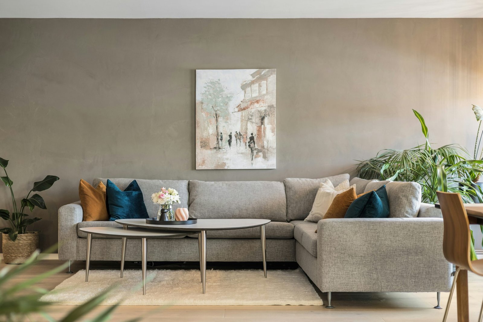
1. Cinnamon Slate – The Ultimate Sophisticated Neutral
Benjamin Moore’s Color of the Year, Cinnamon Slate 2113-40, represents a delicate mix of heathered plum and velvety brown that brings smooth familiarity to any design. This sophisticated neutral works beautifully in abstract art, botanical prints, and contemporary photography, offering versatility while maintaining visual interest.
2. Earthy Sage and Muted Olives
Sage, ochre, lavender and pink are heading into fall and 2025 as classic colors with slight tonal shifts—fresh takes on familiar colors. These grounding greens connect us to nature while providing the calming effects our overstimulated minds crave. Perfect for botanical wall art and landscape photography.
3. Rich Burgundy and Deep Wine Tones
Jewel tones such as rich burgundy and vibrant sapphire are adding touches of luxury and elegance to contemporary wall art. These deep, sophisticated shades create dramatic focal points while maintaining timeless appeal.
4. Vibrant Sapphire and Cobalt Blues
Rich jewel tones – emerald green, cobalt blue, and ruby red – are used to make statements in otherwise minimalist spaces. These bold blues energize spaces while promoting focus and clarity, making them perfect for home offices and creative areas.
5. Warm Camel and Sophisticated Beiges
Warm, sophisticated neutrals with camel and beige tones offer cozy and timeless appeal. These versatile shades complement virtually any interior style while providing the grounding energy that contemporary homes need.
6. Calming Blue-Greens and Teals
Calm and peaceful colors with earthy tones, like blue-green, settle down the dust in your mind, creating natural, harmonious atmospheres that blend boldness with soothing calm. These transitional shades bridge cool and warm palettes beautifully.
7. Complex Muddied Pastels
Complex muddier pink, purple, green, and yellow tones with earthy, grounded bases evoke the calm patina of natural materials. These sophisticated pastels offer the gentleness of traditional pastels with the depth and complexity that modern design demands.
8. Deep Terracotta and Warm Ochres
Deep terracotta paired with forest green, or electric blue grounded with warm ochre create intentional and curated combinations. These earth-inspired shades ground spaces while adding warmth and personality.
9. Electric and Coral Accent Colors
Very bright coral red, ultra black magentas, and very deep cobalt blues show community optimism and emotional competencies. These energizing accents work brilliantly in small doses to activate neutral spaces.
10. Forest Green and Natural Emeralds
Earthy and subdued greens are core parts of interior palettes, often complementing earthy neutrals, with earth tones like muted olive bringing sense of groundedness. These nature-inspired greens promote relaxation and connection to the outdoors.
11. Soft Lavenders and Purple Undertones
Building on the cinnamon slate trend, purple undertones are appearing throughout 2025’s color palette. These sophisticated purples add depth and mystery while maintaining approachability and warmth.
12. Dopamine-Boosting Brights
Dopamine Decor focuses on color psychology, using bold shades and playful patterns to instantly boost mood. These energizing colors include electric yellows, vibrant oranges, and shocking pinks that energize and inspire.
Frequently Asked Questions
Consider your room’s natural light, existing furnishings, and intended mood. Cool colors like blue-greens work well in south-facing rooms with abundant light, while warm tones like cinnamon slate excel in north-facing spaces. Test colors in different lighting conditions before committing.
Absolutely! Combinations like deep terracotta with forest green or electric blue grounded with warm ochre feel intentional and curated. The key is maintaining balance—use one color as dominant, another as secondary, and the third as accent.
Abstract designs dominate the wall art scene with bold colors, geometric shapes, and fluid forms offering modern and sophisticated looks. These trending colors also excel in botanical prints, contemporary photography, and mixed-media pieces.
Not at all! Sophisticated neutrals with camel and beige tones continue offering cozy and timeless appeal. However, 2025’s neutrals are more complex, with subtle undertones that add depth and interest.
Color psychology plays a crucial role. Calm colors with earthy tones settle the mind and create harmonious atmospheres, while bold shades instantly boost mood through dopamine stimulation.
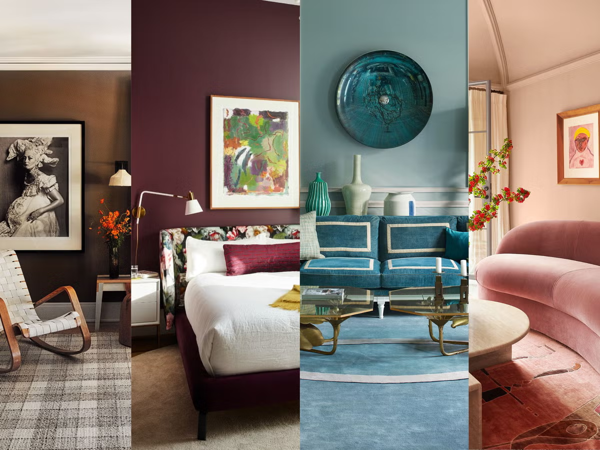
Color Combinations That Create Magic
Understanding trending colors is just the beginning—the real magic happens when you combine them strategically. This year’s most successful color combinations create emotional journeys through spaces while maintaining visual cohesion.
Sophisticated Earth Palettes combine cinnamon slate with warm ochres and sage greens, creating environments that feel both modern and timeless. These combinations work exceptionally well in living spaces where relaxation is paramount.
Energizing Jewel Combinations pair sapphire blues with burgundy accents and neutral bridges, creating spaces that feel both calming and invigorating. Perfect for dining rooms and social spaces.
Nature-Inspired Harmonies blend blue-greens with terracotta and cream, mimicking natural landscapes while bringing outdoor tranquility indoors.
The Psychology Behind 2025’s Color Preferences
This year’s trending colors reflect broader cultural shifts toward emotional wellness, environmental consciousness, and authentic self-expression. Trending color palettes for 2025 include Zen, Vintage Revival, Sunrise, Bold and Beautiful, and Nordic themes from tranquility and nostalgia to bold statements.
The popularity of complex, muddied tones suggests our collective desire for sophistication over simplicity. We’re moving beyond primary colors toward nuanced shades that tell stories and evoke emotions.
Similarly, the emphasis on earth tones reflects growing environmental awareness and our need to reconnect with nature. These colors provide psychological grounding in an increasingly digital world.
How to Incorporate Trending Colors Into Your Wall Art Collection
Start small with accent pieces in trending colors before committing to large statement works. This approach allows you to experiment with color relationships while minimizing financial risk.
Consider your lighting carefully. Trending colors like cinnamon slate and complex pastels look dramatically different under various lighting conditions. Test samples in your space throughout the day before making final selections.
Layer colors gradually. Begin with neutral bases in trending shades, then add bolder accents through smaller pieces. This strategy creates cohesive color stories while allowing flexibility for future changes.
Investment Potential of Trending Color Art
Wall art featuring 2025’s trending colors often appreciates faster than pieces in outdated palettes. However, focus on quality and artistic merit rather than color trends alone when building investment collections.
Look for pieces by emerging artists working in trending palettes. These combinations of artistic talent and market relevance often yield the best long-term returns while providing immediate aesthetic satisfaction.
Seasonal Considerations for Color Trends
While trending colors remain relevant year-round, subtle seasonal variations enhance their effectiveness. Spring calls for brighter versions of trending colors, while autumn benefits from deeper, richer interpretations.
Winter showcases dramatic jewel tones beautifully, while summer allows lighter interpretations of earth tones to shine. Adjust your wall art seasonally to maximize color impact throughout the year.
Color Longevity and Future Predictions
The 2025 trending colors show staying power beyond typical trend cycles. Colors like cinnamon slate and sophisticated earth tones have timeless qualities that suggest long-term relevance.
However, expect evolution rather than replacement. Future trends will likely build upon these foundations, adding new accent colors while maintaining the sophisticated, emotionally-driven approach that defines 2025.
Conclusion: Your Color Journey Starts Now
The trending wall art colors of 2025 represent more than aesthetic choices—they’re powerful tools for creating spaces that support your emotional well-being, reflect your personal values, and enhance your daily life. From sophisticated cinnamon slate to energizing dopamine brights, this year’s palette offers unprecedented opportunities for self-expression and environmental transformation.
Don’t wait to embrace these game-changing colors. The most stunning pieces featuring trending palettes are disappearing fast as conscious consumers recognize their transformative power. Whether you’re drawn to calming earth tones or energizing jewel shades, now is the perfect time to refresh your wall art collection.
Remember, the best trending colors are those that speak to your soul while enhancing your space’s functionality. Trust your instincts, experiment with combinations, and create the colorful, mood-boosting environment you deserve.
Start your color transformation today—your walls are waiting for the magic that only 2025’s trending colors can deliver. The perfect piece in your ideal trending color is out there, ready to revolutionize your space and elevate your daily experience.