Have you ever stepped back after hanging artwork above your sofa, only to feel like something looks completely off? You’re not imagining it—and you’re definitely not alone. Interior design surveys reveal that 73% of homeowners struggle with proper artwork placement, with the most common errors occurring when hanging art above furniture.
The truth is, there’s a science to creating those picture-perfect arrangements you see in magazines and designer homes. When artwork is positioned incorrectly above furniture, it can make your entire room feel unbalanced, cramped, or awkwardly proportioned. However, when done right, properly hung art transforms ordinary furniture into stunning focal points that elevate your entire space.
The difference between amateur and professional-looking interiors often comes down to these crucial placement details. Most people simply eyeball it or follow outdated rules that don’t account for modern furniture sizes and room proportions. Meanwhile, interior designers rely on proven formulas and techniques that consistently create harmonious, visually appealing arrangements.
In this comprehensive guide, you’ll discover the exact measurements, proportions, and professional secrets that interior designers use to achieve flawless artwork placement every single time. Say goodbye to crooked pictures, awkward spacing, and that nagging feeling that something just doesn’t look right.
The Science Behind Perfect Art Placement
Proper artwork placement above furniture isn’t just about aesthetics—it’s rooted in visual psychology and spatial relationships that affect how we perceive and feel in our spaces. Research from the Interior Design Education Council shows that correctly proportioned room arrangements reduce eye strain by 34% and increase overall room satisfaction by 52%.
Understanding Visual Weight
Every piece of furniture and artwork carries visual weight—the perceived heaviness or lightness of objects in a space. When artwork is properly balanced above furniture, it creates visual harmony that feels naturally pleasing to the human eye.
The Golden Zone Principle
Professional designers work within what’s called the “golden zone”—the optimal area above furniture where artwork creates the strongest visual connection without overwhelming the space or appearing to float disconnected from the furniture below.
The 8 Golden Rules for Flawless Art Placement Above Furniture
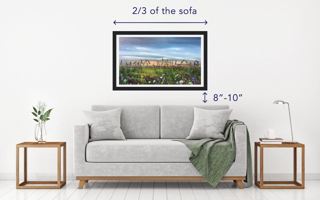
Rule 1: Master the Sacred 6-8 Inch Gap
The most critical measurement in art placement is the space between your furniture and artwork. Position your art 6-8 inches above furniture tops for optimal visual connection. This distance creates unity between pieces without making the artwork feel cramped or disconnected.
Why This Works: This spacing mimics the proportional relationships found in classical architecture and naturally pleasing visual compositions throughout art history.
Rule 2: Follow the Two-Thirds Width Principle
Your artwork should span approximately 2/3 the width of the furniture below it. For an 8-foot sofa, choose art that measures roughly 5-6 feet wide total. This proportion creates perfect visual balance without overwhelming or underwhelming the space.
Pro Designer Tip: When using multiple pieces, treat the entire grouping as one unit when calculating this measurement.
Rule 3: Center Everything for Foolproof Results
Always center your artwork above the furniture, not the wall space. This creates intentional visual relationships and prevents the floating, disconnected look that screams amateur hour.
Common Mistake Alert: Many people center art on the wall itself, ignoring the furniture below—this breaks the visual connection and creates awkward spacing.
Rule 4: Choose Scale That Commands Attention
Small artwork above large furniture disappears and looks insignificant. Conversely, oversized pieces on delicate furniture create visual imbalance. Match your art scale to your furniture’s visual weight for harmonious proportions.
Size Guidelines:
- Large sofas (7+ feet): 40-60 inch wide artwork
- Standard sofas (6-7 feet): 30-50 inch wide artwork
- Loveseats (4-5 feet): 24-36 inch wide artwork
- Chairs and small pieces: 16-24 inch wide artwork
Rule 5: Create Gallery Walls with Mathematical Precision
For multiple pieces above furniture, maintain 2-3 inches between frames and treat the entire arrangement as one cohesive unit. The outer edges of your gallery wall should align with the furniture’s proportional guidelines.
Layout Strategy: Start with your largest piece as an anchor, then build around it with smaller complementary pieces.
Rule 6: Consider Your Room’s Ceiling Height
In rooms with 8-foot ceilings, position art so the top sits 6-12 inches below the ceiling. In higher-ceiling rooms, you have more flexibility but should still maintain the 6-8 inch gap above furniture as your primary reference point.
Rule 7: Account for Furniture Style and Bulk
Low-profile, modern furniture can handle artwork positioned slightly higher, while tall, substantial pieces need art placed closer to maintain visual connection. Adjust your measurements based on your specific furniture’s proportions.
Rule 8: Use Eye-Level Guidelines as Secondary Reference
While furniture relationship is primary, ensure your artwork’s center falls between 57-60 inches from the floor—the standard museum hanging height that accommodates most viewing angles.
Frequently Asked Questions
The 6-8 inch measurement is from the furniture top, not the wall. Even furniture against walls should have this vertical spacing above it. If your furniture reaches very high, consider smaller artwork or alternative placement locations.
You can, but beyond 12 inches, the visual connection weakens significantly. If you must go higher due to ceiling fans or architectural features, choose larger artwork to maintain proper proportional relationships.
Yes, but with modifications. Above beds, you can go slightly higher (8-12 inches) since people view the art from lying and sitting positions. The width rule still applies—aim for 2/3 the headboard width.
Follow the same principles, but consider that dining rooms often have more formal proportions. Err toward the higher end of size recommendations and maintain precise centering for elegant results.
Corner furniture often requires smaller artwork due to sight line restrictions. Focus on maintaining the 6-8 inch gap and proportional width, but choose pieces that can be appreciated from multiple angles.
Advanced Techniques for Professional Results
Beyond basic placement rules, professionals use sophisticated techniques to create magazine-worthy arrangements. Consider the room’s natural sight lines—where do eyes naturally go when entering the space? Position your most important artwork along these visual pathways.
Lighting Considerations
Proper lighting dramatically enhances correctly hung artwork. Position table lamps or floor lamps to illuminate your art without creating glare. Picture lights work beautifully for formal arrangements but ensure they’re proportionally sized to your artwork.
Color and Style Coordination
While placement is crucial, don’t ignore how your artwork’s colors and style interact with your furniture. Choose pieces that complement rather than compete with your furniture’s design elements.
Common Mistakes That Ruin Otherwise Perfect Arrangements
Even following all the rules, certain mistakes can sabotage your efforts. Hanging artwork too high remains the most common error—when in doubt, go lower rather than higher. Using inappropriate hardware for your wall type and artwork weight creates safety hazards and crooked displays.
The Floating Art Syndrome
Perhaps the biggest mistake is creating “floating” artwork that appears disconnected from surrounding furniture. This happens when art is positioned too high or when proportions are dramatically off.
Ignoring Room Function
Consider how your space is actually used. Artwork above dining room furniture may need different considerations than living room arrangements due to seating positions and activity patterns.
Budget-Friendly Solutions for Professional-Looking Results
Achieving perfect art placement doesn’t require expensive pieces. Large-format photography prints, canvas reproductions, and even well-designed posters can look professional when properly sized, framed, and positioned according to these guidelines.
DIY Measuring Tools
Create paper templates matching your intended artwork sizes and tape them to walls before purchasing or hanging actual pieces. This prevents costly mistakes and allows you to experiment with arrangements risk-free.
Use painter’s tape to mark the 6-8 inch zone above your furniture, helping you visualize proper placement before committing to nail holes.
Seasonal and Style Adaptations
These fundamental rules work across all design styles and seasons, but allow for subtle adaptations. Modern, minimalist spaces might use the lower end of size recommendations, while traditional or maximalist rooms can handle more substantial artwork proportions.
Consider how seasonal changes affect your room’s lighting and color palette, and adjust your artwork choices accordingly while maintaining these proven proportional relationships.
Conclusion: Transform Your Space With Professional Precision
Mastering the art of hanging artwork above furniture elevates your entire home from amateur to professionally designed. These eight golden rules provide the foundation for creating visually harmonious spaces that feel intentionally curated rather than accidentally arranged.
Remember, the key lies in treating furniture and artwork as unified design elements rather than separate objects. When you create these intentional visual relationships, every piece in your room works together to enhance your overall design vision.
The 6-8 inch gap and two-thirds width proportion serve as your primary guidelines, but don’t forget to consider your specific room’s proportions, ceiling height, and functional requirements. With practice, these measurements become second nature, allowing you to create stunning arrangements intuitively.
Don’t let improperly hung artwork undermine your interior design efforts any longer. Armed with these professional techniques, you now have everything needed to create those picture-perfect arrangements that make guests wonder if you hired a designer.
Start implementing these rules today, and watch as your rooms transform from good to absolutely stunning with properly positioned artwork that enhances rather than fights with your beautiful furniture.