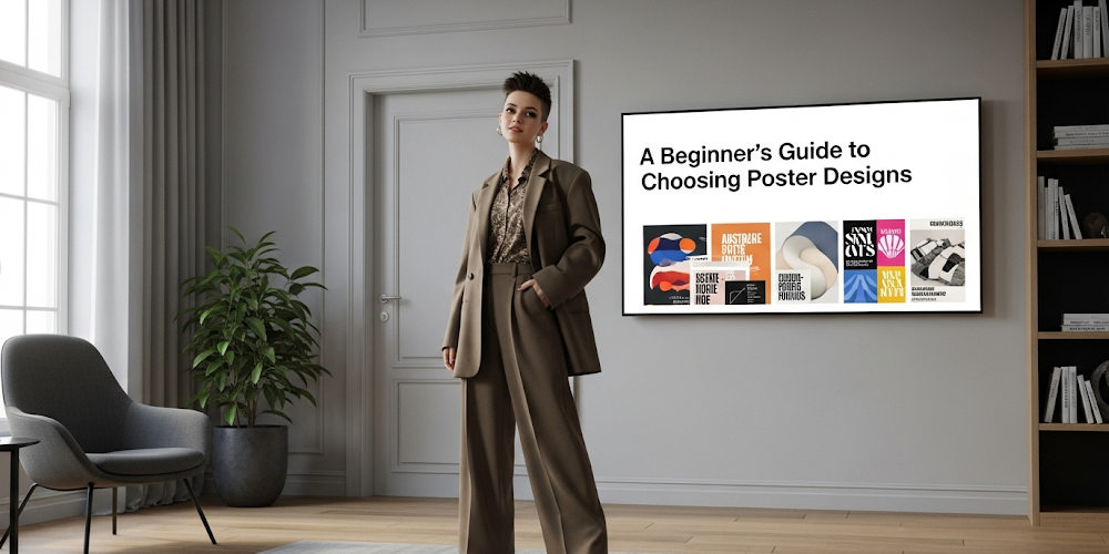
The beginner’s guide choosing poster design can transform your space from bland to extraordinary, yet many newcomers feel overwhelmed by countless options, styles, and technical considerations. Understanding fundamental selection principles empowers anyone to make confident decisions that enhance their environment while expressing personal style effectively.
Recent interior design studies show that 87% of homeowners struggle with wall art selection, often making expensive mistakes or living with blank walls indefinitely. However, systematic approaches to poster selection eliminate guesswork while ensuring chosen designs align with both aesthetic preferences and practical requirements.
This comprehensive guide simplifies the selection process through proven strategies that professionals use daily. Moreover, these techniques work equally well for home decorators, students, office managers, and anyone seeking to enhance their visual environment through thoughtful poster selection decisions.
Understanding Basic Design Principles for Smart Poster Selection
Visual Impact and First Impressions
Effective poster selection begins with understanding how visual elements create immediate emotional responses and lasting impressions. Color psychology research demonstrates that warm colors energize viewers while cool tones promote calmness and focus, making initial color choices crucial for achieving desired atmospheric effects.
Typography readability affects message communication significantly, especially when posters serve informational purposes. Sans-serif fonts generally provide better distance readability, while serif options work well for detailed reading in closer proximity situations.
Composition balance ensures visual harmony through strategic placement of text, images, and white space. The rule of thirds guides element positioning, while contrast levels determine attention flow and message hierarchy effectiveness.
Scale and Proportion Considerations
Room size dictates appropriate poster dimensions, with oversized pieces overwhelming small spaces while tiny prints disappear in large areas. Architectural Digest recommends that wall art should cover 60-75% of available wall space above furniture for optimal visual balance.
Viewing distance influences size requirements significantly. Hallway posters need larger text and simpler designs than desk-adjacent pieces intended for close examination and detailed information consumption.
Furniture relationships affect perceived scale, with artwork appearing larger when positioned above low furniture and smaller above tall pieces. Understanding these optical illusions helps beginners make appropriate size selections consistently.
Step-by-Step Process for Choosing the Perfect Poster Design
Define Your Purpose and Space Requirements
The beginner’s guide choosing process starts with clearly identifying why you need the poster and where it will be displayed. Educational environments require different approaches than decorative applications, while promotional materials demand distinct considerations from artistic expressions.
Measure your available wall space accurately, considering furniture placement, lighting conditions, and traffic patterns that might affect viewing angles and poster longevity. Document these measurements for reference during shopping or design consultations.
Budget parameters influence every subsequent decision, from design complexity to printing quality and framing options. Establishing realistic financial boundaries prevents costly mistakes and ensures selected options align with available resources effectively.
Research and Inspiration Gathering
Successful poster selection benefits from systematic research across multiple sources and style categories. Pinterest provides extensive collections of poster designs across every imaginable theme, enabling mood board creation and style preference identification.
Professional design portfolios showcase high-quality examples while demonstrating how poster selections integrate with broader interior design schemes. Study successful implementations to understand effective color coordination, sizing decisions, and placement strategies.
Industry trend analysis reveals emerging styles and enduring classics, helping beginners distinguish between temporary fads and timeless approaches that provide lasting satisfaction and visual appeal over extended periods.
Style Categories and Selection Criteria for Every Aesthetic
Modern and Contemporary Design Approaches
Contemporary poster design emphasizes clean lines, bold typography, and strategic use of negative space that creates sophisticated visual impact through simplified compositions. These approaches work exceptionally well in modern homes, offices, and commercial environments.
Geometric patterns and abstract compositions provide visual interest without overwhelming smaller spaces or competing with existing décor elements. Color palettes typically feature neutrals with strategic accent colors that coordinate with existing furnishings.
Photography-based posters showcase everything from architectural details to nature scenes, offering realistic imagery that connects viewers with specific places, emotions, or concepts while maintaining contemporary aesthetic sensibilities.
Traditional and Classic Style Options
Traditional poster designs draw inspiration from historical periods, featuring ornate typography, detailed illustrations, and rich color palettes that complement classic interior design schemes and formal environments effectively.
Botanical prints, vintage travel advertisements, and literary quotes represent popular traditional categories that provide timeless appeal while avoiding dated trends that may quickly appear outdated or inappropriate.
Framing choices become particularly important for traditional designs, with ornate frames enhancing period authenticity while simple frames allow artwork to dominate visual attention without distraction from decorative frame elements.
Color Theory and Psychology in Poster Design Selection
Emotional Response and Atmosphere Creation
Color choices dramatically influence room atmosphere and occupant mood through psychological associations developed over lifetimes of cultural and personal experiences. Understanding these connections enables strategic selection that supports intended environmental goals.
Blue promotes productivity and calmness, making it ideal for office environments and study spaces. Green suggests growth and natural harmony, working well in health-related settings and relaxation areas throughout homes and offices.
Red creates energy and urgency, perfect for entertainment spaces and promotional materials but potentially overwhelming in bedrooms or meditation areas where calm atmospheres are preferred over stimulating environments.
Coordination with Existing Décor
Successful color integration requires analyzing existing room elements including wall colors, furniture finishes, textile patterns, and lighting characteristics that affect color perception throughout different times of day and seasons.
Monochromatic schemes using various shades of single colors create sophisticated, harmonious appearances while avoiding color conflicts that can make spaces feel chaotic or visually overwhelming to occupants and visitors.
Accent color strategies introduce vibrant elements through poster selections while maintaining overall color harmony with existing décor investments. This approach provides visual interest without requiring major redecorating efforts or expenses.
Size, Placement, and Technical Considerations
Optimal Sizing for Different Spaces
The beginner’s guide choosing appropriate sizes depends on wall dimensions, furniture scale, and intended viewing distances that vary significantly across different room types and usage patterns throughout homes and commercial spaces.
Small spaces benefit from single large pieces rather than multiple small posters that can create visual clutter and make areas feel even more cramped than actual dimensions suggest to occupants and guests.
Gallery wall arrangements combine multiple posters of varying sizes to create dynamic visual displays that work well in larger spaces with ample wall area available for creative arrangements and artistic expression.
Strategic Placement for Maximum Impact
Eye-level positioning ensures optimal viewing comfort while maintaining visual connection with room occupants during normal activities. Standard eye level ranges from 57-60 inches from floor to poster center, though adjustments accommodate furniture height variations.
Lighting considerations affect poster visibility and color accuracy throughout daily lighting changes. Natural light exposure can cause fading over time, while artificial lighting should enhance rather than compete with poster colors and details.
Traffic flow patterns influence placement decisions, with high-traffic areas requiring durable mounting and protective framing while quiet corners accommodate more delicate materials and experimental display methods without damage risks.
Budget-Friendly Solutions for Quality Poster Selection
Cost-Effective Design Sources
Digital printing services offer professional-quality results at affordable prices, with many online platforms providing templates, customization options, and bulk pricing that makes high-quality posters accessible to tight budgets.
Free design resources including stock photography sites, font libraries, and template collections enable custom poster creation without hiring professional designers or purchasing expensive software licenses for occasional use.
Local print shops often provide competitive pricing and personalized service that online alternatives cannot match, while supporting community businesses and enabling face-to-face consultations for technical questions and quality concerns.
Long-Term Value Considerations
Investment in quality printing and framing materials ensures poster longevity and maintains appearance over years of display, potentially providing better value than frequent replacement of cheaper alternatives that degrade quickly.
Versatile designs that coordinate with various décor styles and color schemes provide flexibility for future room changes without requiring poster replacement, maximizing initial investment value through extended usefulness.
Classic themes and timeless aesthetics resist trend-based obsolescence better than highly stylized contemporary designs that may appear dated within short timeframes, ensuring continued satisfaction and relevance over time.
Common Mistakes and How to Avoid Them
Sizing and Proportion Errors
Oversized posters can overwhelm small spaces while creating visual imbalance that makes rooms feel uncomfortable and poorly proportioned. Always measure carefully and consider viewing distances before finalizing size decisions.
Undersized selections disappear visually in large spaces, failing to provide intended impact or visual anchor points that rooms need for proper aesthetic balance and psychological comfort for occupants.
Multiple small posters scattered randomly across walls create visual chaos rather than intentional design schemes. Group smaller pieces into cohesive arrangements or choose single larger pieces for cleaner appearances.
Color and Style Coordination Issues
Clashing color combinations create visual tension and discomfort rather than the harmony that good design should provide. Study color wheel relationships and test combinations before committing to final selections permanently.
Style mixing without unifying elements results in incoherent appearances that suggest poor planning rather than intentional eclectic approaches. Establish common threads through color, frame style, or thematic connections when combining different aesthetics.
Ignoring existing room elements leads to poster selections that compete with rather than complement established décor investments, creating expensive conflicts rather than harmonious enhancements to living or working environments.
Frequently Asked Questions
Measure your wall space and aim for posters that cover 60-75% of the available area above furniture. For walls without furniture, consider the room’s overall scale – small rooms need proportionally smaller posters while large spaces can accommodate bigger pieces. Always mock up the size with newspaper or painter’s tape before purchasing to visualize the final appearance.
Analyze your room’s existing color palette including walls, furniture, and textiles. Choose posters that either complement these colors using analogous schemes or provide controlled contrast through accent colors. Take photos of your space to compare with potential poster options, and consider how lighting affects color perception throughout the day.
Your decision should depend on budget, permanence, and personal values. Printed posters offer excellent value, easy replacement, and wide style variety perfect for renters or those who enjoy changing décor frequently. Original artwork provides investment potential and unique character but requires higher commitment and careful selection for long-term satisfaction.
Plan your arrangement on the floor first, maintaining 2-3 inches between frames and keeping the overall collection’s center point at eye level. Use consistent frame styles or colors to unify different pieces, vary sizes for visual interest, and include one larger anchor piece. Start with odd numbers of pieces and expand gradually rather than filling all available space immediately.
Conclusion
The beginner’s guide choosing poster design successfully combines systematic planning with personal aesthetic preferences to create satisfying results that enhance any environment. Understanding basic design principles, color psychology, and placement strategies empowers newcomers to make confident decisions that avoid common mistakes while achieving professional-looking results.
Remember that poster selection improves with practice and observation of what works in different contexts. Start with clear objectives, research thoroughly, and don’t hesitate to experiment with arrangements and styles as your confidence and experience grow over time.