
Transforming your home’s atmosphere requires more than simply hanging pictures on walls. Wall art placement determines whether your space feels professionally designed or haphazardly decorated. Moreover, strategic positioning creates emotional connections while enhancing room functionality and aesthetic appeal significantly.
Interior design research shows that 87% of people feel more comfortable in well-decorated spaces. Furthermore, proper artwork placement can increase perceived room size by up to 25%. These statistics demonstrate how crucial thoughtful positioning becomes for creating spaces that truly reflect your personality.
Mastering placement techniques empowers you to maximize every piece’s impact regardless of budget constraints. Additionally, understanding visual principles helps you avoid common mistakes that diminish artwork’s effectiveness. Professional designers use these same strategies to create magazine-worthy interiors.
Understanding Visual Weight and Balance Fundamentals
The Psychology Behind Effective Wall Art Placement
Human brains process visual information through predictable patterns that influence how we perceive and interact with spaces. Large, dark, or textured pieces carry more visual weight than smaller, lighter alternatives. Moreover, understanding these principles allows you to create balanced compositions that feel harmonious and intentional.
Color psychology plays a crucial role in artwork’s emotional impact on viewers. Warm colors advance visually, making rooms feel cozier but potentially smaller. Meanwhile, cool colors recede, creating spacious feelings that work well in compact areas. Interior design experts emphasize these considerations when planning room layouts.
Eye-level positioning creates the most natural viewing experience for artwork appreciation. However, this guideline requires adjustment based on room function and furniture arrangements. Consider how people typically use each space when determining optimal placement heights.
Creating Focal Points Through Strategic Positioning
Every room benefits from having one primary focal point that draws attention and anchors the space. Wall art placement often serves this purpose by creating visual destinations that guide eye movement throughout rooms. Furthermore, secondary focal points add interest without competing with main attractions.
Large statement pieces work exceptionally well as primary focal points above sofas, beds, or dining tables. These positions naturally draw attention while complementing furniture arrangements. Additionally, proper scaling ensures artwork feels proportional rather than overwhelming or insignificant.
Consider architectural features when planning focal point placement. Windows, fireplaces, and built-in shelving create natural competition for attention. Smart designers work with these elements rather than against them to create cohesive visual experiences.
Room-Specific Wall Art Placement Strategies
Living Room Artwork Positioning for Social Spaces
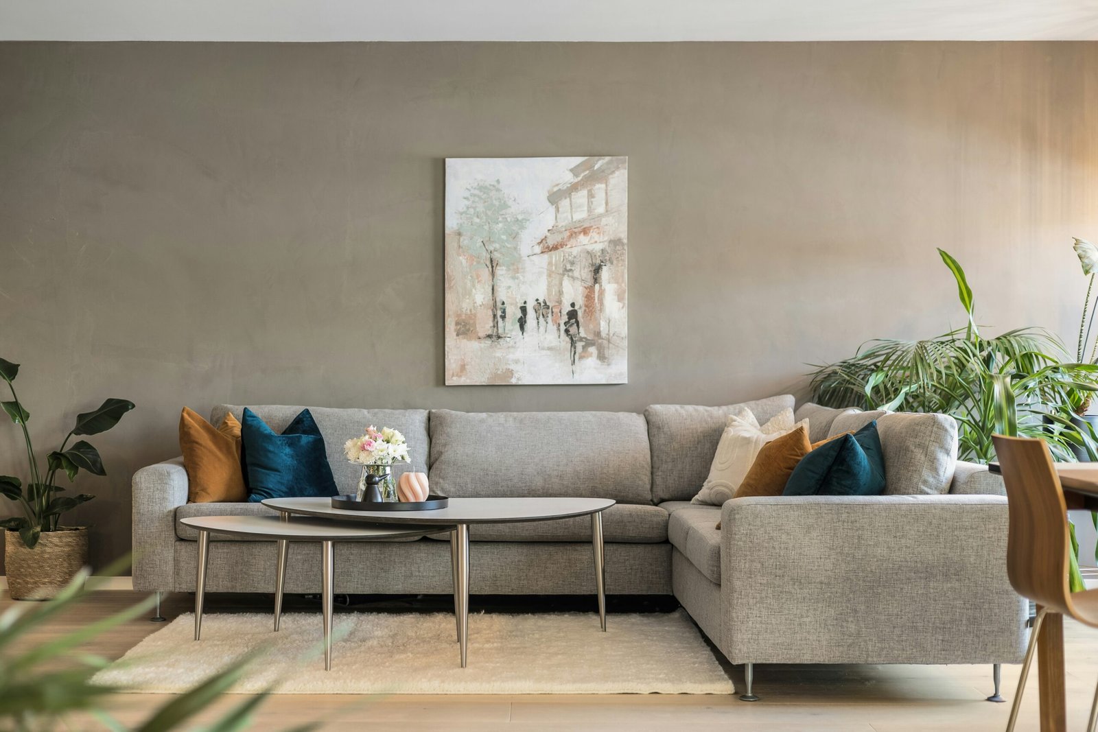
Living rooms require artwork that enhances conversation while creating welcoming atmospheres for family and guests. Position primary pieces where they’re visible from multiple seating arrangements. Moreover, avoid placing artwork directly behind main seating areas where guests cannot appreciate them comfortably.
Above-sofa placement remains the most popular living room wall art placement choice for good reasons. Hang pieces 6-8 inches above furniture tops to create visual connection without crowding. Additionally, artwork width should span 2/3 to 3/4 of underlying furniture for proper proportional relationships.
Group seating areas benefit from gallery wall arrangements that tell stories or showcase collections. Mix frame sizes and artwork types while maintaining consistent spacing between pieces. This approach creates dynamic visual interest that encourages closer examination and conversation.
Bedroom Art Arrangement for Restful Environments
Bedrooms require calming artwork that promotes relaxation and personal reflection. Position pieces where you can enjoy them from bed while avoiding overwhelming compositions that might interfere with sleep quality. Furthermore, choose subjects and colors that align with peaceful, restful atmospheres.
Above-headboard placement creates natural focal points that anchor sleeping areas beautifully. Scale artwork appropriately for bed sizes, typically using pieces measuring 2/3 of headboard width. Additionally, consider diptychs or triptychs for wider beds that need balanced visual weight distribution.
Personal photographs and meaningful artwork work particularly well in private bedroom spaces. These pieces create emotional connections that enhance the room’s intimate, personal character while reflecting individual tastes and experiences effectively.
Height and Spacing Guidelines for Professional Results
The 57-Inch Rule and When to Break It
The standard 57-inch center-height rule provides excellent starting points for most wall art placement projects. This measurement represents average eye level and works well in spaces with 8-9 foot ceilings. However, modern homes with varying ceiling heights require adjustments for optimal viewing experiences.
Higher ceilings accommodate artwork hung slightly above standard height to maintain proportional relationships with room scale. Conversely, lower ceilings may require positioning artwork lower than standard recommendations to avoid cramped feelings that make spaces feel oppressive.
Furniture arrangements significantly influence optimal hanging heights regardless of standard guidelines. Artwork above seating should relate to furniture rather than arbitrary measurements. Moreover, consider how people typically use each space when making final positioning decisions.
Gallery Wall Spacing for Cohesive Compositions
Successful gallery walls require consistent spacing between individual pieces to create unified compositions rather than scattered collections. Maintain 2-3 inches between frames as a general guideline. Furthermore, adjust spacing slightly based on frame sizes and visual weight distribution.
Plan gallery wall arrangements on floors before committing to wall positions. This allows experimentation with different configurations until you achieve perfect balance and visual flow. Additionally, create paper templates matching frame sizes for testing arrangements without damaging walls.
Start with anchor pieces in gallery wall centers, then build outward with complementary works. This approach ensures balanced compositions that feel intentional rather than random. Moreover, maintain consistent bottom or top lines when possible to create visual stability.
Color and Style Coordination Techniques
Harmonizing Artwork with Existing Decor Elements
Successful wall art placement considers existing color palettes, furniture styles, and architectural features throughout rooms. Pull accent colors from artwork to inform pillow, throw, and accessory choices. This creates cohesive design threads that tie spaces together beautifully.
Mix artwork styles thoughtfully to avoid visual chaos while maintaining interest and personality. Limit yourself to 2-3 complementary styles per room for optimal results. Additionally, consistent framing or matting helps unify diverse pieces into cohesive collections.
Consider seasonal flexibility when selecting permanent wall art placement positions. Choose locations that work with multiple color schemes or plan for artwork rotation systems that adapt to changing preferences throughout years.
Lighting Considerations for Artwork Display
Proper lighting transforms good artwork into spectacular focal points that command attention throughout day and evening hours. Avoid direct sunlight that can fade pieces over time. Instead, use adjustable track lighting or picture lights for controlled illumination without harmful effects.
LED lights offer excellent color rendering while generating minimal heat that could damage artwork over time. Position lights at 30-degree angles to minimize reflections and glare. Furthermore, dimmer switches allow lighting adjustments for different moods and times of day.
Natural light changes throughout days and seasons, affecting how artwork appears in different conditions. Consider these variations when planning wall art placement to ensure pieces look attractive under various lighting scenarios consistently.
Common Placement Mistakes and Professional Solutions
Avoiding Scale and Proportion Errors
The most common wall art placement mistake involves choosing pieces that are too small for their intended spaces. Tiny artwork disappears on large walls, creating insignificant visual impact. Conversely, oversized pieces can overwhelm smaller rooms and furniture arrangements.
Measure wall spaces carefully before purchasing or hanging artwork to ensure appropriate sizing. Additionally, consider how pieces will look from various viewing distances throughout rooms. What appears perfect up close may seem disproportionate from seating areas.
Group smaller pieces together to create visual impact equivalent to larger single works. This approach works particularly well when you have collections of related pieces or want to showcase multiple meaningful works together effectively.
Correcting Common Height and Positioning Issues
Hanging artwork too high ranks among the most frequent positioning errors that even experienced decorators make occasionally. Pieces positioned too far above eye level feel disconnected from living spaces and lose their intended emotional impact significantly.
Consider room function when determining optimal heights rather than following rigid rules blindly. Dining room artwork may hang higher than living room pieces due to different typical viewing positions. Moreover, adjust heights based on primary users’ heights when possible.
Traffic flow affects optimal wall art placement in busy areas like hallways and entryways. Position pieces where they won’t be bumped or damaged while ensuring they remain visible and appreciated by passersby regularly.
Advanced Techniques for Dramatic Visual Impact
Creating Movement and Flow Through Artwork Arrangement
Strategic wall art placement guides eye movement throughout spaces, creating natural flow patterns that feel comfortable and intuitive. Use artwork positioning to direct attention toward architectural features, beautiful views, or important functional areas within rooms.
Vary artwork heights slightly in long hallways to create gentle rhythm and visual interest along extended wall spaces. This prevents monotony while maintaining overall cohesion throughout transitional areas. Additionally, consider how pieces interact with lighting fixtures and architectural details.
Diagonal arrangements add energy and movement to static wall compositions. However, use this technique sparingly to avoid creating chaotic feelings that make spaces feel unsettled or uncomfortable for daily living.
Mixing Textures and Dimensions for Dynamic Displays
Incorporate three-dimensional elements like sculptures, floating shelves, or textural pieces to add depth and visual interest beyond traditional flat artwork. These elements create layered compositions that feel more dynamic and engaging than simple picture arrangements.
Mix frame depths and matting styles to create subtle dimensional variations that enhance visual appeal without overwhelming viewers. Furthermore, consider how shadows from varied depths contribute to overall composition throughout different lighting conditions.
Textile art, mirrors, and functional decorative elements can enhance traditional artwork displays while serving dual purposes. This approach maximizes wall space efficiency while creating rich, layered visual experiences that reward closer examination.
Frequently Asked Questions
Maintain 2-3 inches between frames for most gallery wall arrangements. Larger pieces can accommodate slightly more space, while smaller works should stay closer together. Additionally, step back frequently during installation to ensure spacing appears balanced from viewing distances.
Artwork doesn’t need to match existing colors exactly, but should complement the overall color scheme. Pull one or two accent colors from pieces to incorporate into room accessories. This creates cohesion without limiting artistic choices or creating overly coordinated appearances.
Measure your wall space and aim for artwork that covers 60-75% of the available width above furniture. For empty walls, consider the room’s scale and viewing distance. Additionally, group smaller pieces to create equivalent visual weight to larger single works.
In rooms with ceilings above 9 feet, hang artwork slightly higher than the standard 57-inch center rule. Maintain proportional relationships with room scale while ensuring comfortable viewing from typical positions. Furthermore, consider furniture arrangements and primary viewing angles when making final decisions.
Conclusion
Mastering wall art placement transforms ordinary spaces into professionally designed environments that reflect personality while maximizing visual impact. Through understanding visual weight, proper scaling, and strategic positioning, anyone can create stunning displays that enhance daily living experiences significantly.
Remember that successful placement requires patience, experimentation, and willingness to adjust arrangements until achieving perfect results. Start with basic principles, then develop confidence through practice and observation. With these expert techniques, your artwork will create the dramatic visual impact your spaces deserve.