Small spaces present unique decorating challenges that require creative solutions and strategic thinking. However, typography prints transform even the tiniest rooms into visually appealing, functional areas that feel spacious and purposeful through clever design applications.
Typography offers powerful tools for space transformation because text-based art creates visual interest without physical bulk. Unlike three-dimensional decorative objects, typography prints add personality and style while maintaining the clean, uncluttered aesthetic essential for small space success.
Studies reveal that 67% of urban dwellers live in spaces under 600 square feet, making small space design increasingly relevant for modern homeowners. Strategic use of typography can make these compact areas feel larger, brighter, and more inviting.
This comprehensive guide reveals professional interior design secrets for using typography prints effectively in small spaces, helping you maximize visual impact while maintaining functionality and creating environments that truly reflect your personality and lifestyle preferences.
Understanding Small Space Design Principles
Visual weight distribution plays a crucial role in small space success. Typography prints offer lightweight decorative solutions that add character without overwhelming limited square footage or creating cluttered appearances that make spaces feel cramped.
Light reflection and color psychology significantly impact perceived space size. Light-colored typography prints with strategic placement can bounce light around rooms, creating illusions of greater depth and openness that transform confined areas.
Vertical space utilization draws eyes upward, creating impressions of height and grandeur even in low-ceiling rooms. Typography prints positioned strategically on walls guide attention vertically, making spaces feel taller and more expansive.
Focal point creation helps organize small spaces visually while providing interesting elements that distract from size limitations. Well-chosen typography serves as artwork that anchors room designs without requiring floor space or bulky furniture additions.
How Typography Prints Transform Narrow Hallways
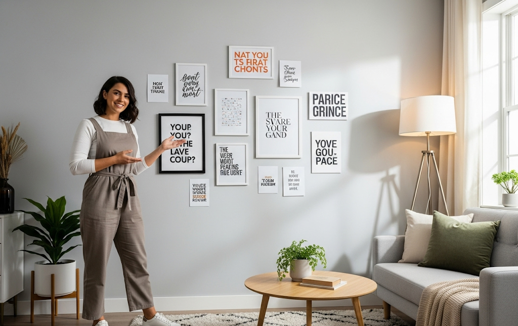
Narrow hallways benefit enormously from typography treatments that add personality while maintaining traffic flow. Linear arrangements of typography prints create gallery-like experiences that transform transitional spaces into destination areas worth admiring.
Strategic lighting enhances typography visibility in typically dim hallway spaces. Philips Hue smart lighting systems can highlight typography prints while providing adjustable illumination that adapts to different times and activities.
Scale considerations prevent overwhelming narrow spaces with oversized typography. Multiple smaller prints often work better than single large pieces in confined corridors, creating rhythmic visual experiences that guide movement naturally.
Color coordination between typography and existing hallway elements creates cohesive design schemes that make spaces feel intentional rather than afterthought areas. Monochromatic approaches often work particularly well in narrow spaces.
Mirror integration with typography creates depth illusions that visually expand narrow hallways. Combining reflective surfaces with carefully chosen text creates dynamic, layered effects that add sophistication to utilitarian spaces.
Typography Solutions for Compact Living Rooms
Wall-mounted typography eliminates need for floor space while providing substantial visual impact in compact living areas. Floating installations create clean lines that support minimalist aesthetics essential for small space success.
Multi-functional typography serves dual purposes by combining decorative appeal with practical information like family calendars, daily schedules, or inspirational reminders that keep small spaces organized and purposeful.
Corner utilization maximizes often-neglected space areas through strategic typography placement. Corner-specific designs can transform dead space into interesting focal points that add character without interfering with furniture arrangements.
Seasonal typography allows easy updates that keep small spaces feeling fresh without requiring major decorating investments. Interchangeable elements prevent visual stagnation while maintaining budget consciousness important for many small space dwellers.
Color temperature coordination between typography and ambient lighting creates cohesive atmospheres that make small living rooms feel warm and inviting rather than cramped or institutional.
Typography Prints Transform Tiny Bedrooms
Headboard alternatives using typography create striking focal points without requiring floor space or bulky furniture investments. Large-scale text installations behind beds provide dramatic effects while maintaining bedroom functionality.
Inspirational messaging supports positive morning and evening routines in personal bedroom spaces. Motivational typography helps small bedrooms serve dual purposes as both sleeping areas and personal retreat spaces.
Space-saving mounting techniques eliminate need for traditional frames or stands that consume precious surface area in tiny bedrooms. Direct wall applications and adhesive methods maintain clean aesthetics.
Color psychology applications help small bedrooms feel restful and spacious through strategic typography color choices. Cool tones and light colors generally work best for creating serene, expansive-feeling environments.
Storage integration combines typography with functional elements like hooks, shelves, or organizers that maximize utility in space-constrained bedroom environments while maintaining attractive appearances.
Small Kitchen Typography Design Strategies
Backsplash typography eliminates need for separate wall decorations while adding personality to functional kitchen areas. Food-related quotes and family sayings work particularly well in these social spaces.
Cabinet-integrated typography transforms utilitarian storage into decorative elements without consuming counter space precious in small kitchens. Vinyl applications work well on smooth cabinet surfaces.
Window typography takes advantage of natural light while providing privacy solutions in compact kitchen spaces. Frosted text applications filter light beautifully while maintaining functionality.
Magnetic typography offers flexibility for frequently changing kitchen needs like shopping lists, meal planning, or family schedules. Removable elements adapt to evolving requirements without permanent installations.
Color coordination with existing kitchen elements prevents typography from competing with necessary appliances and fixtures while still providing desired personality and warmth.
Bathroom Typography Print Applications
Moisture-resistant materials ensure typography longevity in high-humidity bathroom environments. Laminated prints, vinyl applications, and specialty papers withstand bathroom conditions while maintaining appearance quality.
Mirror integration creates depth illusions particularly valuable in small bathroom spaces. Typography combined with mirrors doubles visual impact while serving practical grooming functions effectively.
Vertical arrangements maximize wall space utilization in typically narrow bathroom layouts. Floor-to-ceiling typography arrangements create height impressions that make small bathrooms feel less confined.
Privacy considerations guide typography placement and content selection in bathroom applications. Abstract designs or single words often work better than lengthy quotes in intimate spaces.
Light optimization through strategic typography placement enhances natural and artificial illumination in often poorly-lit bathroom spaces. Light-colored typography reflects available light effectively.
Typography Prints Transform Home Office Spaces
Motivational typography supports productivity in small home office environments where inspiration and focus become essential for work success. Strategic message placement maintains visibility during work hours.
Organization integration combines typography with functional elements like calendars, schedules, or reminder systems that help small offices serve multiple purposes efficiently while maintaining professional appearances.
Brand consistency for business owners extends professional identity into home office spaces through carefully selected typography that reflects business values and personality while maintaining appropriate workplace atmosphere.
Distraction management through thoughtful typography placement prevents visual clutter that can reduce productivity in confined workspace environments. Strategic positioning maintains inspiration without overwhelming focus.
Technology integration allows digital typography displays that adapt to changing work needs, project requirements, or seasonal business cycles without requiring physical space for multiple installations.
Frequently Asked Questions
Focus on medium-sized prints measuring 8×10 to 11×14 inches for optimal impact without overwhelming tiny spaces. Multiple smaller pieces often work better than single large installations. Consider the viewing distance – typography should be readable from the furthest point in the room. Avoid oversized prints that dominate walls and make spaces feel even smaller.
Use removable adhesive strips, magnetic systems, or tension rods for damage-free installations. Vinyl wall decals remove cleanly when applied properly. Command strips work well for lightweight frames. Create seasonal typography collections that interchange easily without requiring new mounting hardware or wall modifications that violate lease agreements.
Light colors like white, cream, or pale yellow reflect available light and create spacious feelings in dark, compact areas. Avoid dark typography that disappears into shadows. Consider metallic accents that catch and reflect light sources. Typography prints transform dark spaces most effectively when they contrast strongly with wall colors for maximum visibility and impact.
Limit typography to one statement wall per room, use consistent color schemes, and maintain adequate white space around each piece. Choose quality over quantity – fewer, well-placed pieces create more impact than multiple small elements. Coordinate typography colors with existing decor to create cohesion rather than visual competition throughout small spaces.
Advanced Typography Techniques for Space Enhancement
Layering effects create visual depth that makes small spaces appear larger and more complex. Strategic overlapping of typography elements with different opacities or sizes produces sophisticated results that add interest without consuming additional space.
Perspective manipulation through angled or converging typography lines creates illusions of extended space and movement. These advanced techniques require careful planning but produce dramatic results in confined areas.
Interactive typography incorporates elements that change or respond to touch, lighting, or movement. These dynamic installations add entertainment value while maximizing space efficiency through multi-functional design approaches.
Integration with smart home systems allows typography to display changing information like weather, schedules, or inspirational quotes that adapt to daily routines and seasonal changes automatically.
Measuring Typography Impact in Small Spaces
Before and after photography documents transformation effectiveness and provides objective measures of typography impact on space perception and functionality improvements over time.
Visitor feedback provides valuable insights into whether typography successfully creates desired impressions of spaciousness, style, and functionality in small space environments.
Mood tracking helps determine whether typography positively affects daily experiences and emotional responses to small space living situations and overall quality of life improvements.
Functionality assessments evaluate whether typography installations interfere with or enhance daily activities and space utilization in confined living environments.
Conclusion
Typography prints transform small spaces into stylish, functional environments that maximize visual impact while maintaining the clean aesthetics essential for successful compact living. Through strategic placement, thoughtful color selection, and creative integration techniques, even the tiniest spaces can become showcases of personal style and design sophistication.
Success in small space typography requires understanding fundamental design principles, choosing appropriate scales and colors, and prioritizing functionality alongside aesthetic appeal. These techniques enable anyone to create beautiful, livable spaces regardless of square footage limitations or budget constraints.

